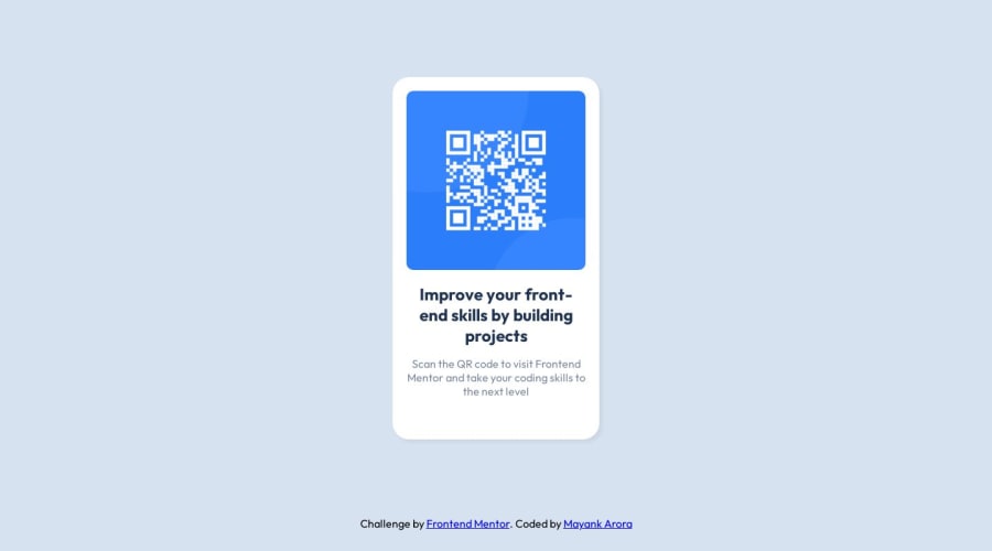
QR Component | Mobile First solution with CSS Flexbox
Design comparison
Solution retrospective
Hi Frontendmentor community,
This is my QR component beginner challenge solution and my first submission. I was having difficulty in making the large size of my solution's <main> container to smaller dimensions to match the solution .jpg screenshot given on the challenge page. I request the community to review and give feedback for the live site and the shared source code on the following parameters-
- Does it follow all the good web accessibility practices?
- Is the site mobile first and responsive on all devices?
- Do all the padding, margin and border settings comply with the original design(as i am not a pro member and do not have access to the design files)?
- Are all the colors and font settings matching the original design?
- Do you have any other code refactoring suggestion?
Please feel free and do not hesitate to review my code and do give feedback for improvement. All suggestions are welcome. Waiting to learn from your feedback and experience. Thank you for reviewing my challenge submission.
Community feedback
- @lukasrihaPosted about 1 year ago
Hi Mayank,
I just saw you liking a comment of mine on another project so i decided to check out one of your projects.
-
I'm not an expert on a11y (accesibility), but using semantic html is always a good start. From my experience, accessibility starts getting complicated once controls are involved. You know, buttons with handlers, opening / closing menus etc. If you want a quick check you can use google lighthouse - that's built in with google chrome, it will generate a report for you and let you know where your problems are. In your case, the only it detected was that the background is too similar to the font colour - that's not your fault though, you implmeneted the design. :) if you want to be super sure, just download a plugin/extension for chrome :)
-
Your website looks good on mobile and desktop - so it's responsive enough i'd say. In my opinion, a responsive website is a combination of fluid and adaptive. Look up those terms and see if you can make sense of that. Just my opinion though ;) I'm my opinion, a good practice is to make use of width and max-width. If you look at something like bootstrap, container widths are set to 100%, but they do have a max width set. You don't want containers with 100% on an ultra wide monitor
-
Don't have pro either. ;)
-
Didn't check sorry :)
-
Refactoring wise - The code base is small, so your code works well. Look into something called BEM - it's a way of writing html and css.
Otherwise two remarks:
- Import your fonts in your html in the head elements. It is better for performance because of caching and parallel downloads.
- When you have <a> tags to external links, make sure to add noopener, noreferrer. It's a security best practice.
Overall, great job and happy hacking :)
Marked as helpful1@mayankdrvrPosted about 1 year ago@onenKokos Thank you Lukas for the code review. I was hoping some generous community member would spend some time to evaluate my work and help me improve it. You and people like you make beginners like me feel welcome and inspired with your guidance. I will surely refactor the source code as per your suggestions.
UPDATE: I have implemented the following code refactoring suggestions in my source code as per the feedback that i have received-
- Block Element Modifier(BEM) methodology in CSS.
- Noopener & noreferrer security best practice in <a> tags.
- Imported fonts in HTML file instead of CSS.
- Used width and max-width in container CSS to make it more responsive.
- Generated google lighthouse report and all parameters were satisfactory.
1 -
Please log in to post a comment
Log in with GitHubJoin our Discord community
Join thousands of Frontend Mentor community members taking the challenges, sharing resources, helping each other, and chatting about all things front-end!
Join our Discord
