

Design comparison

Solution retrospective
Created QR component as my first challenge. I think I can improve more on CSS. Any feedback from your side will be appreciated. Thanks
Community feedback
- @Islandstone89Posted 10 months ago
HTML:
-
Every webpage needs a
<main>that wraps all of the content, except for<header>andfooter>. This is vital for accessibility, as it helps screen readers identify the "main" section of a page. Change.maininto a<main>, and give it a class of.card. -
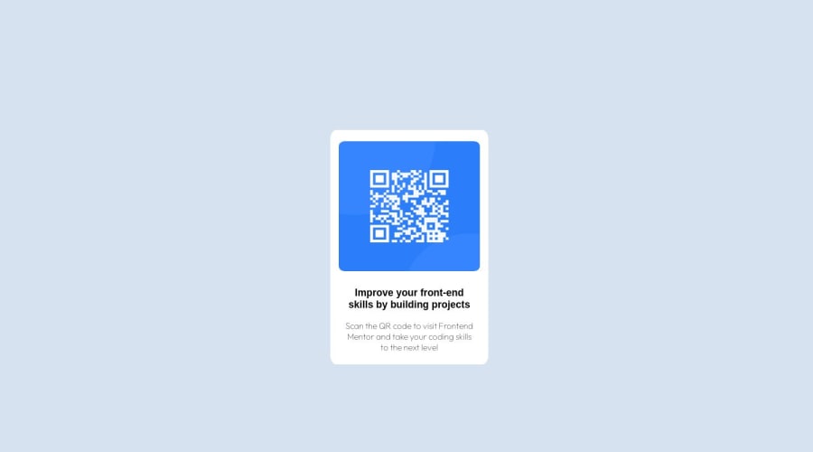
The image has meaning, so it must have proper alt text. Write something short and descriptive, without including words like "image" or "photo" - screen readers announce images by saying "image", and then the alt text. So, "image of a qr code" would be read as "image, image of a qr code". The alt text also needs to say where it leads (frontendmentor.io).
-
Headings should always be in order, so you never start with a
<h3>. Change it into a<h1>.
CSS:
-
It's good practice to include a CSS Reset at the top.
-
Since all text should be centered, you only need to set
text-align: centeron the body, and remove it elsewhere. The children will inherit the value. -
Likewise, all text should have the same font: put
font-family: "Outfit", sans-serif;on thebody, and remove it elsewhere. Also, removefont-family: sans-serifon the heading. -
Use
pxinstead of%forborder-radius. -
font-sizemust never be in px. This is bad for accessibility, as it prevents the font size from scaling with the user's default setting in the browser. Use rem instead. -
Remove the
marginon the card. Instead, use Flexbox to center it horizontally and vertically - set the following on its parent, thebody:
display: flex; flex-direction: column; justify-content: center; align-items: center; min-height: 100vh;-
Remove all fixed widths and heights (in
px). Except for sometimes on icons, you should rarely set fixed dimensions (especially heights). -
Add a
max-widthof around20remon the card, to prevent it from getting too wide on larger screens. -
Remove:
position: absolute; top: 50%; left: 50%;-
Add
display: blockandmax-width: 100%on the image - the max-width prevents it from overflowing its container. -
To create the space between the image and the edge of the card, set
paddingon all 4 sides of the card.
Marked as helpful0@b-kuhuPosted 10 months ago@Islandstone89 thanks for the feedback. Will look into improving my code further.
0 -
- @AashishVivekBhatPosted 10 months ago
Hello Kuhu, your solution is great. Some improvements that i can suggest :
-
Using relative units like rem, em instead of absolute units px while defining height, width, font-size etc. This may help in making it more responsive for different range of screens.
-
Element tags like
<main>, <h1>etc in your HTML may help in improving accessibility and semantics. -
You can also use MarkupValidationService to validate your HTML/CSS code.
Hope it was of some help, Happy learning.
0@b-kuhuPosted 10 months ago@AashishVivekBhat will definitely look into this. Thanks for the feedback.
0 -


Please log in to post a comment
Log in with GitHub
Join our Discord community
Join thousands of Frontend Mentor community members taking the challenges, sharing resources, helping each other, and chatting about all things front-end!
Join our Discord