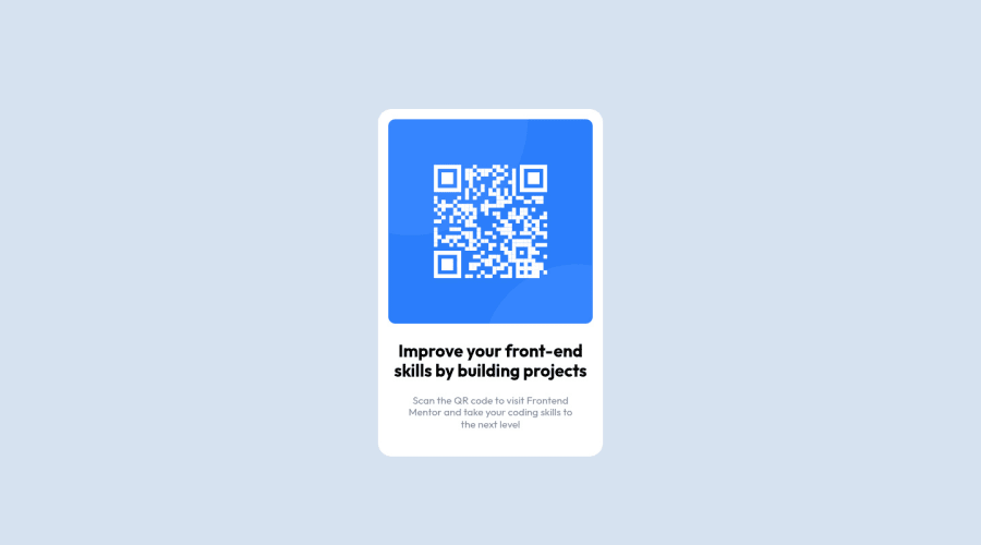
QR component challenge, using webpack, SCSS/CSS, HTML, BEM-convention
Design comparison
Solution retrospective
Definitely have to focus on mastering flex and grid i think that's my weakest point. Also do you think that my BEM naming class was allright?
Community feedback
- @PhoenixDev22Posted over 2 years ago
Hi Rafał,
Congratulation on completing this frontend mentor challenge. Your solution looks great. I have some suggestions regarding your solution, if you don't mind:
- In my opinion, the alternate text is needed on this image. The alternate text should indicate where the Qr code navigate the user : like
QR code to frontend mentornot describes the image.
width: 330px;an explicit width is not a good way to have responsive layout . consider usingmax-widthto the card inreminstead .
height: 510px;It's not recommended to set height to component, let the content of the component define the height.
- Consider using rem and em units as they are flexible, specially for font size better to use rem. If your web content font sizes are set in absolute units, such as pixels, the user will not be able to re-size the text or control the font size based on their needs. Relative units “stretch” according to the screen size and/or user’s preferred font size, and work on a large range of devices.
- Remember a css reset on every project. That will do things like set the images to display block and make all browsers display elements the same.
- Using percentages for widths, using max-width and avoiding to set heights for the components, with these things is the key to mastering responsive layouts.
Aside from these , Great job on this one.
Marked as helpful0@rafal-bedkowskiPosted over 2 years ago@PhoenixDev22 thank's for feedback, You have right, with that height declaration, my mistake. I think that css is much more complex that I imagine, i will focus more about the topics you are mentioned.
Thank You once more for feedback
1@PhoenixDev22Posted over 2 years ago@rafal-bedkowski You’re welcome and glad it was helpful. Happy coding!
0 - In my opinion, the alternate text is needed on this image. The alternate text should indicate where the Qr code navigate the user : like
- @correlucasPosted over 2 years ago
👾Hello RAFAŁ, congratulations for your new solution!
Its nice that you've used BEM here, its an amazing way to give a standard for you CSS code.
I think BEM is an amazing tool for bigger projects, like Landing Pages.
In this challenge I don't really recommend, because you create a huge code for a really small component, for example, in this challenge you don't really need any class since you can select everything with the direct selectors for each elements
main, h1, img and p.See the cleanest structure for this challenge without any class:
<body>
<main>
<img>
<h1></h1>
<p></p>
</main>
</body>
👋 I hope this helps you and happy coding!
Marked as helpful0@rafal-bedkowskiPosted over 2 years ago@correlucas You right, I can easily do that with just simple CSS and html file.
But i'd like to try the SCSS/ BEM approach, and use the bigger file stack to get more used to it.
I think that will help me to manage learning framework much easier ;)
It doesn't change the fact, that i really appreciate Your feedback.
Take care, and have fun with coding :D
0
Please log in to post a comment
Log in with GitHubJoin our Discord community
Join thousands of Frontend Mentor community members taking the challenges, sharing resources, helping each other, and chatting about all things front-end!
Join our Discord
