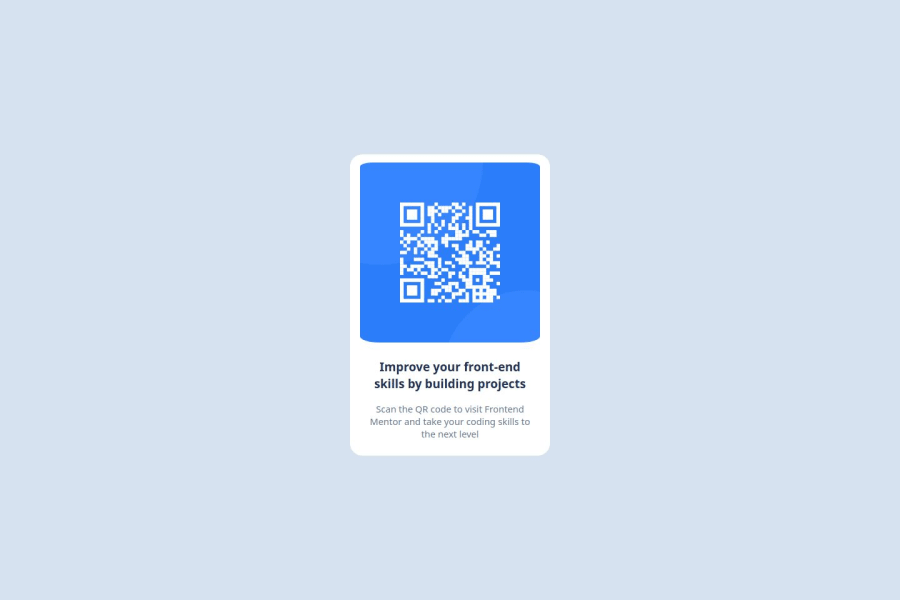
Design comparison
Solution retrospective
Completing the challenge was an achievement despite it being my first time doing this on my own. I have only used HTML and CSS, so I'd consider to use some frameworks to simply my process.
What challenges did you encounter, and how did you overcome them?I am not get used to CSS, so it was a little difficult as I went along. However, while researching, I found some properties that helped me a lot.
What specific areas of your project would you like help with?When moving forward, I consider that I should observe the use of the percentage in the width or max-width, since I would like it to be adaptable to different screen sizes.
Community feedback
- @JamesN-devPosted 4 months ago
Not bad for your first time. Pretty good! It’s great that you're diving in head first.
Here are a few thoughts and suggestions that might help you refine things a bit:
-
Layout Structure:
- I noticed you’re using Flexbox, which is perfect for centering elements. One thing you might consider is wrapping related items in
<div>
containers. It can give you a bit more control over the layout and make it easier to manage styles.
- I noticed you’re using Flexbox, which is perfect for centering elements. One thing you might consider is wrapping related items in
-
Responsiveness:
- It looks like you’re using percentage widths, which is a good start. To make sure the card looks good on all screen sizes, you could try adding
max-width
andmin-width
. That way, it won’t get too small or too big, depending on the device. - Media queries might be something to look into next as well. They let you tweak styles for different screen sizes, like maybe bumping up the font size on larger screens for better readability.
- It looks like you’re using percentage widths, which is a good start. To make sure the card looks good on all screen sizes, you could try adding
-
Styling:
- The box shadow gives the card a nice depth. Great job on that.
- Your colors match the original perfectly. Great job on that as well.
-
Image and Text Styling:
- The rounded corners on the QR code look a little flat on one side. You could fix that by using the same
border-radius
value instead of different values for each corner. - The text looks good and is easy to read. Maybe try playing with the font sizes or weights to create a bit more hierarchy between the heading and the paragraph.
- The rounded corners on the QR code look a little flat on one side. You could fix that by using the same
Overall, you’ve done a fantastic job. You have a solid base here to improve upon. Keep experimenting and having fun. Thats really what its all about.
Cheers, JamesN
0@LeikoRedPosted 4 months agoHi @JamesN-dev about responsiveness, so you say that it could be like:
width: 100%; max-width: 220px; min-width: 80px;
I was considering using media queries, but since it was my first time, I didn't want to add many styles.
With
border-radius
I have a problem. At the beginning, I only putborder-radius: 20px
However, when I see the qr image, The bottom corners are not rounded, they remain as they are. That's why I tried to increase them side by side until a change is noticed. I was seeing if any other styles are interfering with it, but haven't found one so far.
Thank you very much for your feedback, I appreciate it so much.
0 -
Please log in to post a comment
Log in with GitHubJoin our Discord community
Join thousands of Frontend Mentor community members taking the challenges, sharing resources, helping each other, and chatting about all things front-end!
Join our Discord