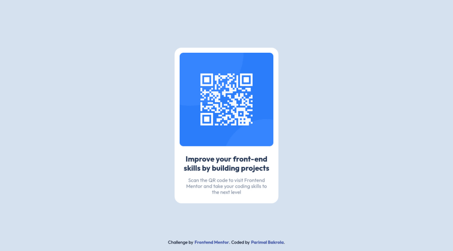
QR Component challenge using CSS Grid and Flexbox


Design comparison

Solution retrospective
Please provide your feedback on how I could have made the code better and more efficient. I think I could have used something better instead of using 'magic numbers' for the card's width. I will update the code and make it more accessible, efficient as I learn more.
Community feedback
- @Guille-SanchezPosted about 2 years ago
Hi! First of all your work looks pretty good. I took a quick look to your code and css and seems all right for the project. Specially I liked how you named your classes. Regarding your question of no using magic numbers for the card's width, the way I would have approach to it is by fixing the width of the image. And from having an image with a fixed width (i.e. width: 300px; height: auto; object-fit: contain). After that, I would try to make the hole card fit the width I want with padding. I find this approach more maintainable in the future because in case you want to change the image, you will have only one point of change instead.
If you want the image to increase/reduce size by making it responsive I would recommend you to search for the css function called clamp and use rem instead of px for such units. THIS LAST PART is a little bit more advanced, so take it with a grain of salt. You are doing well my man, I would recommend you to practice another exercise instead of stressing yourself with making this exercise perfect. There are more interesting exercises beyond, just improve a little bit each time you solve one
Marked as helpful0@parimaldesignPosted about 2 years ago@Guille-Sanchez Thanks for taking the time to give me feedback and for your kind words. I had no idea about "clamp function", and 'object-fit' and units like 'em' and 'rem' are among the newer CSS stuff that I have slowly started to include in my work.
0 - @Bader-IdrisPosted about 2 years ago
You can set the container in the middle of the screen whatever user changes it when you add these properties to it in CSS:
.container {
  display: absolute;
  top:50%;
  left: 50%;
  transform: translate(-50%, -50%);
}
the new feature is transform, it has many lovely properties you can discover, I personally love it. Hope it's useful
0@parimaldesignPosted about 2 years ago@Bader-Idris I have used a grid to center the card and I avoid using "position: absolute" to position large blocks. Because using it may lead to a bit of hacky CSS to adjust it in a real-world project. I also absolutely love CSS transform.
0


Please log in to post a comment
Log in with GitHub
Join our Discord community
Join thousands of Frontend Mentor community members taking the challenges, sharing resources, helping each other, and chatting about all things front-end!
Join our Discord