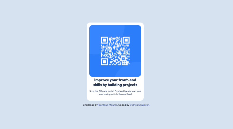
Design comparison
Solution retrospective
I am looking for feedback on the structure of my html and also if the way I have set up my css is the right way to approach a mobile first design. If I have missed out on some best practices, I would like to know that as well.
Thank you for taking the time to review my code. The feedback from experienced developers is invaluable.
Community feedback
- @dusan-bPosted almost 2 years ago
Hello VidsHub,
I just looked at your code and would consider some changes to get a cleaner code and get rid of the media queries completely.
- Instead of setting fixed height on
body
, usemin-height
instead to make it flexible. There is also no need to set a width. The last two rules allow the content to be centered.
body { font-family: 'Outfit', serif; background-color: hsl(212, 45%, 89%); min-height: 100vh; display: grid; place-content: center; }
- Give the card some space on the sides for smaller screen sizes.
main { padding-inline: 1.5rem; }
- For the
card
class you actually need only the following rules.
.card { width: 100%; max-width: 22rem; padding: 1rem; background-color: hsl(0,0%, 100%); border-radius: 1.2rem; }
- The image needs the following rules to appear properly.
.card img { width: 100%; height: auto; border-radius: 1.2rem; }
With these little tweaks, your card will be responsive without the need of media queries. You could, though, keep some of the media queries for typography.
Furhtermore, the
<section>
element is used to indicate a part (or section) of a web page. In this case the card component represents the entire page, so there's no need for this element.Hope this helps. Keep it up, and happy coding :).
Marked as helpful0@VidsHubPosted almost 2 years ago@dusan-b Thank you so much! Truly appreciate your detailed feedback.
The code you outlined is amazingly concise and I learned a lot about grid, padding-inline and keeping media queries to a bare minimum, if at all necessary.
Again, thank you for taking the time to review my code. It gives me the confidence to move on to the next challenge with a better understanding of html5 and css.
1 - Instead of setting fixed height on
Please log in to post a comment
Log in with GitHubJoin our Discord community
Join thousands of Frontend Mentor community members taking the challenges, sharing resources, helping each other, and chatting about all things front-end!
Join our Discord