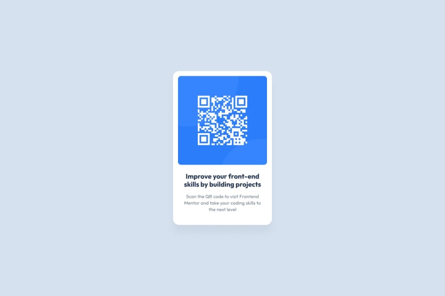
Design comparison
Solution retrospective
One thing I struggled with was getting the proper amount of white space surrounding the QR code image. I just eyeballed it, how would I be able to have more precise white space surrounding the image given that the image exists inside of a card?
Another question I kept having was that in the image the paragraph below the heading was a slight shade lighter but I did not see any styling in the guide that stated how to approach that. How would I fix the paragraph to better math the preview?
Community feedback
- @greenMakaroniPosted about 1 year ago
As for the white space, you realistically got two options, 1st is the margin of the QR code image, and 2nd is the padding of the card. The way I'd approach this is pretty much the same, trial and error eyeballing.
When it comes to the text color, the CSS property "color" lets you set the color of the text, see the reference below: https://www.w3schools.com/css/css_text.asp
You could try different shades of gray to see which one works best, if you want an exact value however, one thing you could do is to import the sample image to paint, use colour picker tool on the gray paragraph, and then navigate to the Edit colours tool and this should give you the exact rgb values of the color you picked.
I hope that will help, overall good job!
Marked as helpful1@LyttleGCPosted about 1 year ago@greenMakaroni thanks for the response! Sounds good for the white space.
As for the text color, that's what I was thinking, I just went with what was given in the style guide. You definitely gave me good ideas though moving forward so I appreciate you Makaroni!
0
Please log in to post a comment
Log in with GitHubJoin our Discord community
Join thousands of Frontend Mentor community members taking the challenges, sharing resources, helping each other, and chatting about all things front-end!
Join our Discord
