Design comparison
SolutionDesign
Community feedback
- @DanCodeCraftPosted about 1 year ago
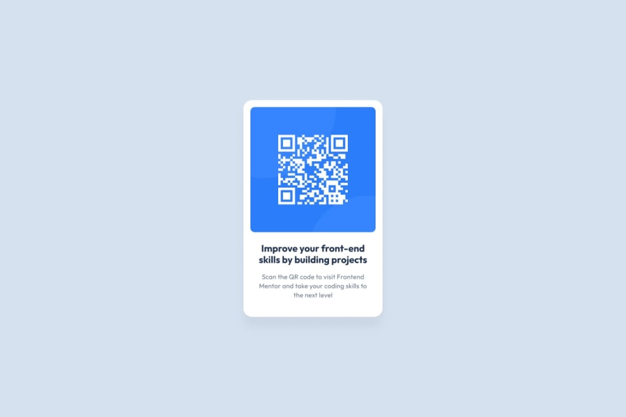
The design is well done. Very similar to the original.
To get even closer, adjusting the spacing and height of the letters should do the trick. I miss the box shadow around the main container, though. And this would be affected by the color choice of the background you selected.
Maybe by using the color suggested and adding the shadow around it, you can get an even better result.
Keep up the good work.
Marked as helpful0
Please log in to post a comment
Log in with GitHubJoin our Discord community
Join thousands of Frontend Mentor community members taking the challenges, sharing resources, helping each other, and chatting about all things front-end!
Join our Discord
