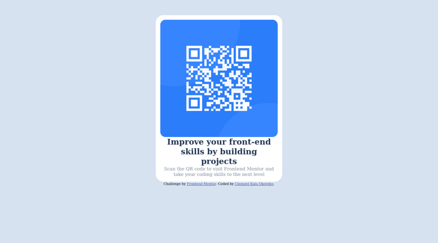
Design comparison
Community feedback
- @correlucasPosted about 2 years ago
👾Hi @Clement1kalu-okereke, congratulations on your solution!👋 Welcome to the Frontend Mentor Coding Community!
Great solution and a great start! From what I saw you’re on the right track. I’ve few suggestions for you that you can consider adding to your code:
1.You need to import the correct font that is
Outfit. First of all you need to choose the font usingGoogle Fontshttps://fonts.google.com/ and import the code to drop on your CSS/HTML:
Here’s the css code for this font and should be placed at the top of your CSS sheet:
@import url('https://fonts.googleapis.com/css2?family=Open+Sans:ital,wght@0,300;0,400;0,700;1,400&family=Outfit:wght@300;400;600;700&display=swap');Add this to the body to add the font to the style:
font-family: 'Outfit', sans-serif;2.Use
<main>instead of<div>to wrap the card container. This way you show that this is the main block of content and also replace the div with a semantic tag.3.Use relative units as
remoreminstead ofpxto improve your performance by resizing fonts between different screens and devices. These units are better to make your website more accessible. REM does not just apply to font size, but to all sizes as well.Here's my solution for this challenge if you wants to see how I build it: https://www.frontendmentor.io/solutions/qr-code-component-vanilla-cs-js-darklight-mode-nS2aOYYsJR
✌️ I hope this helps you and happy coding!
Marked as helpful1
Please log in to post a comment
Log in with GitHubJoin our Discord community
Join thousands of Frontend Mentor community members taking the challenges, sharing resources, helping each other, and chatting about all things front-end!
Join our Discord
