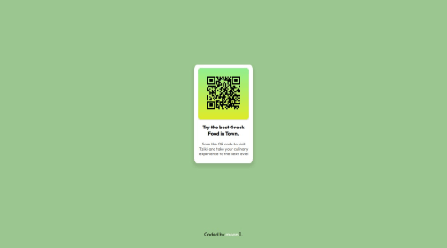
Design comparison
Solution retrospective
I feel good about how well I could implement the layoting and the shadows to match the design template very closely.
What challenges did you encounter, and how did you overcome them?None, Just time taking
What specific areas of your project would you like help with?Ability to think and write code faster.
Community feedback
- @ryyHardyPosted 7 months ago
I really like the way you spiced up the appearance and gave it your own theme. The gradient on the QR code looks sick and it's really eye-catching (especially with the box shadow). I think this is okay because everything else follows the design guide really well.
A few ideas for improvement in the code:
- You don't need to use Flexbox. Instead, you could use "text-align: center;" on the card. For the image, you could just make the width 100% and add some more padding to the card for the same look.
- I would be weary of how many divs there are. I'd recommend a <figure> element.
That's it. It's really tough to poke holes in this.
Marked as helpful1@fullmoonemptysunPosted 7 months ago@ryyHardy
Thank you for the insights:
-
Flexbox is more flexible and responsive and scalable if needed than text align center since text align is better for text literals instead of divs.
-
I achieve the same thing as 100% and padding for the text by setting the width in px, which is truly not as responsive as what you said (100%) so thank you for that, I will implement that in it.
overall, thanks for your comments and inputs. They allowed me to think of different approaches.
0 - @konraddissake1808Posted 7 months ago
Concerning the Design Though it is different than the example. It still looks amazing, really like the creative touch
1
Please log in to post a comment
Log in with GitHubJoin our Discord community
Join thousands of Frontend Mentor community members taking the challenges, sharing resources, helping each other, and chatting about all things front-end!
Join our Discord