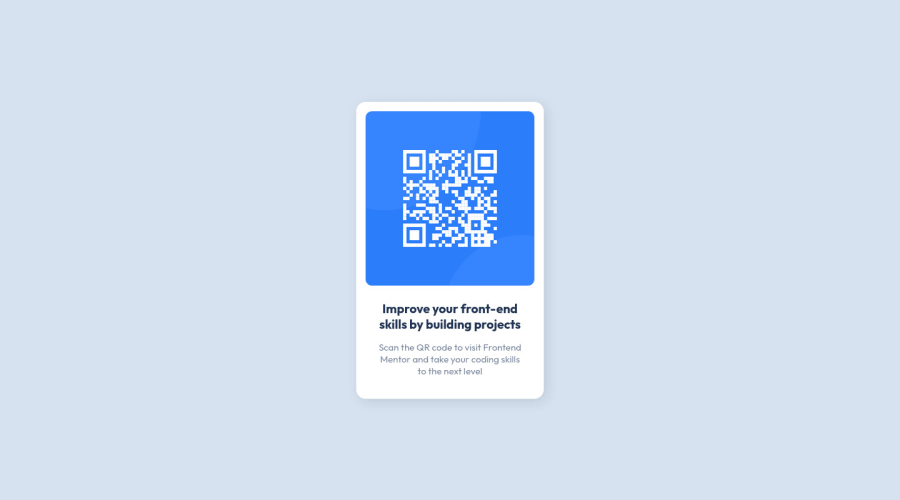
Design comparison
SolutionDesign
Solution retrospective
I think using flexbox wasn't the right way but it was easier for me. When I zoom in on the site, it looks a little strange. I don't know if it's necessary to fix that.
All feedbacks are welcome!
Community feedback
Please log in to post a comment
Log in with GitHubJoin our Discord community
Join thousands of Frontend Mentor community members taking the challenges, sharing resources, helping each other, and chatting about all things front-end!
Join our Discord

