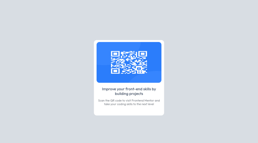
Design comparison
Solution retrospective
Everything went smooth
Community feedback
- @correlucasPosted about 2 years ago
👾Hi @akshaykumarmondal, congratulations on your solution!👋 Welcome to the Frontend Mentor Coding Community!
Great solution and a great start! From what I saw you’re on the right track. I’ve few suggestions for you that you can consider adding to your code:
1.Something I've noticed in your code is that on many occasions you've added some
<div>to wrap contents that don't really need to be inside of a div block. Note that for this challenge all you need is a single block to hold all the content, which can be<div>or<main>if you want to use a semantic tag to wrap the content, the cleanest structure for this challenge is made by a block of content with div/main and all the content inside of it (img, h1 and p) without need of any other div or something. See the structure below:<body> <main> <img src="./images/image-qr-code.png" alt="QR Code Frontend Mentor" > <h1>Improve your front-end skills by building projects</h1> <p>Scan the QR code to visit Frontend Mentor and take your coding skills to the next level</p> </main> </body>2.Add the website favicon inserting the svg image inside the
<head>.<link rel="icon" type="image/x-icon" href="./images/favicon-32x32.png">3.Add the title of the page inserting in the <head> the tag <title> →
<title>QR Code - Front End Mentor</title>Here's my solution for this challenge if you wants to see how I build it: https://www.frontendmentor.io/solutions/qr-code-component-vanilla-cs-js-darklight-mode-nS2aOYYsJR
✌️ I hope this helps you and happy coding!
Marked as helpful1 - @denieldenPosted about 2 years ago
Hello Akshay, You have done a good work! 😁
Some little tips to improve your code:
- add
maintag and wrap the card for improve the Accessibility - also you can use
articletag instead of a simpledivto the container card for improve the Accessibility - remove all unnecessary code, the less you write the better as well as being clearer: for example the
divcontainer of image - remove all
margin and heightfromcontainerclass and setwidth: 22rem - use flexbox to the body to center the card. Read here -> best flex guide
- after, add
min-height: 100vh and margin: 0to body because Flexbox aligns child items to the size of the parent container - instead of using
px or %use relative units of measurement likerem-> read here
Keep learning how to code with your amazing solutions to challenges.
Hope this help 😉 and Happy coding!
Marked as helpful1 - add
Please log in to post a comment
Log in with GitHubJoin our Discord community
Join thousands of Frontend Mentor community members taking the challenges, sharing resources, helping each other, and chatting about all things front-end!
Join our Discord
