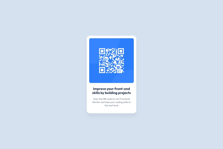
Design comparison
SolutionDesign
Community feedback
- @denieldenPosted over 2 years ago
Hi Ekomobong, great work on this challenge! 😉
Here are a few tips for improve your code:
- add the bg color to body
- add
maintag and wrap the card for improve the Accessibility - remove all unnecessary code, the less you write the better as well as being clearer: for example the
divcontainer of title - to make it look as close to the design as possible add
border-radius: .8remto qr image - remove all
marginfromcapsuleclass - use
h1for the title of card and not a simplep - use flexbox to the body to center the card. Read here -> best flex guide
- after, add
min-height: 100vhto body because Flexbox aligns child items to the size of the parent container - instead of using
pxuse relative units of measurement likerem-> read here
Overall you did well 😁 Hope this help!
Marked as helpful1@KingLyricsPosted over 2 years ago@denielden Thank you for the response! Will do even better next time!
1
Please log in to post a comment
Log in with GitHubJoin our Discord community
Join thousands of Frontend Mentor community members taking the challenges, sharing resources, helping each other, and chatting about all things front-end!
Join our Discord
