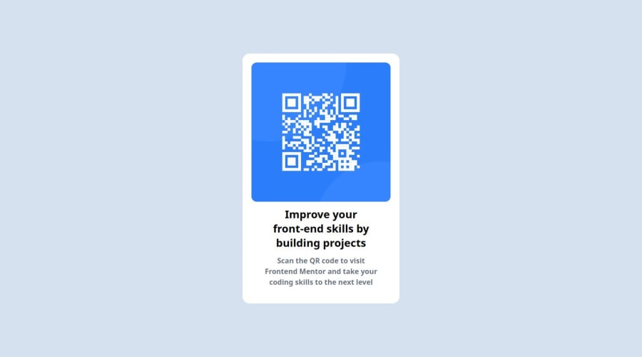
Design comparison
SolutionDesign
Solution retrospective
What are you most proud of, and what would you do differently next time?
Used Tailwind CSS and React JS
What challenges did you encounter, and how did you overcome them?Tailwind css doc
What specific areas of your project would you like help with?Code Review!
Community feedback
- @grace-snowPosted 6 months ago
Hi. Not sure why you've used a framework for such a teeny challenge, seems an odd choice! But all works OK (as long as I keep js on)
Only a few small things to suggest really
- consider improving the alt text on this image. If this card component were to be used multiple times on a page (likely) each alt would need to be specific to its card. In this case the alt should say what the image is (QR code) and where it goes (to FrontendMentor.io)
- reduce layout shift by adding a height and width attribute on the img (or by using aspect-ratio)
- it would be better to have a max width in rem on the component than a width in px. This would ensure it scales correctly for all users no matter what their font size settings are, and would look OK in different layout contexts when used on a page.
1
Please log in to post a comment
Log in with GitHubJoin our Discord community
Join thousands of Frontend Mentor community members taking the challenges, sharing resources, helping each other, and chatting about all things front-end!
Join our Discord
