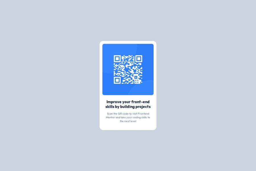
Design comparison
SolutionDesign
Solution retrospective
What are you most proud of, and what would you do differently next time?
Not much to say about this one
Community feedback
- @DylandeBruijnPosted 4 months ago
@Atatra
Hiya! 👋
Congratulations on your solution, it looks very close to the design! I can tell you put a lot of effort into it.
Things I like about your solution 🎉
- Use of semantic HTML elements
Things you could improve ✍️
- I suggest adding a bit of
padding
to yourbody
element so the card has some space around it on smaller viewports.
I hope you find my feedback helpful! 🌟
Let me know if you have more questions and I'll do my best to answer them. 🙋♂️
Happy coding! 😎
Marked as helpful1@AtatraPosted 4 months ago@DylandeBruijn Thank you for your kind feedback! Yeah it took me quite some time, fortunately I had the Figma file so it was easier to stay as close as possible to the original design. 😁 You're totally right about the padding!
Happy coding too! 😉
0
Please log in to post a comment
Log in with GitHubJoin our Discord community
Join thousands of Frontend Mentor community members taking the challenges, sharing resources, helping each other, and chatting about all things front-end!
Join our Discord