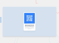
Design comparison
Solution retrospective
It was made with CSS and with the support of the QRCode.JS library. The only detail is that the background circles are missing (I’m still looking for how do it). I would appreciate it if you could give me feedback from on my challenge.
Community feedback
- @NaveenGumastePosted over 2 years ago
Hello Esteban Jiménez Ruiz ! Congo 👏 on completing this challenge
Let's look at some of your issues, shall we:
-
Add Main tag after body
<main class="container"></main>. -
Always use the "alt attribute" and write what img is , and if the img is for decorative then leave it empty but always add it with alt.
-
Reduce the padding above the
ptag.
happy Coding😀
Marked as helpful0@estebXnDKPosted over 2 years agoHi @Crazimonk. I appreciate your feedback. i'm newbie in frontend and many things I do not know how they work but I will put them into practice.
Happy coding 👨💻
1 -
- @shashreesamuelPosted over 2 years ago
Hey estebXnDK, good job completing this challenge. Keep up the good work.
Your design looks great however I think that the card paragraph needs some space from the margin top. This can be achieved using the
margin-topcss property.In terms of your accessibility issues
-
your images need an alternative description,this can be done by specifying the
altattribute in the image tag. -
Wrap all your content between
<main>tags to get rid of the other accessibility errors.
Once you fix your accessibility errors, your validation errors should be fixed.
I hope this helps.
Cheers, Happy coding 👍
Marked as helpful0@estebXnDKPosted over 2 years agoHi @TheCoderGur . I appreciate your feedback. It was very useful and in the future I will pay more attention to those details.
happy coding. 👨💻
0 -
Please log in to post a comment
Log in with GitHubJoin our Discord community
Join thousands of Frontend Mentor community members taking the challenges, sharing resources, helping each other, and chatting about all things front-end!
Join our Discord

