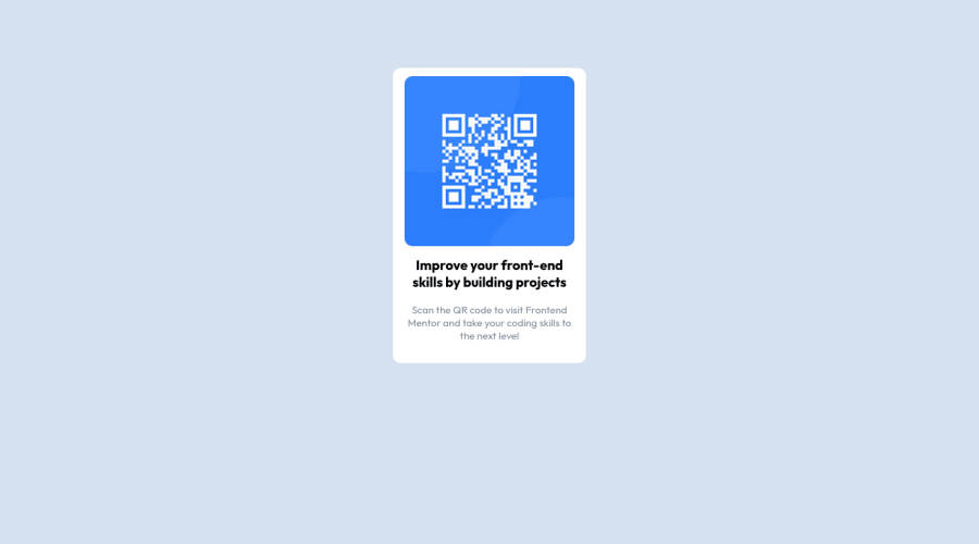
Design comparison
Solution retrospective
- Thank you very much in advance * Is the project valid? or there is something I did wrong, I am new in this field and I would really like to improve. Right now I only have the basics on html and css, and I don't know anything about frameworks and javascript, as everyone advises first really to delve into css and html
Community feedback
- @AdrianoEscarabotePosted about 2 years ago
Hi David, how are you?
Welcome to the front-end mentor community!
I really liked the result of your project, but I have some tips that I think you will enjoy:
- Consider using rem for font size .If your web content font sizes are set in absolute units, such as pixels, the user will not be able to re-size the text or control the font size based on their needs. Relative units “stretch” according to the screen size and/or user’s preferred font size, and work on a large range of devices.
if you want to continue coding with px, you can download a very useful extension in vscode, it converts px to rem! link -> px to rem
to align some content in the center, always prefer do this:
body {
    display: flex;
    align-items: center;
    justify-content: center;
    min-height: 100vh;
}
The rest is great!
I hope it helps... 👍
Marked as helpful0@DavidMBKPosted about 2 years ago@AdrianoEscarabote Thanks very much! I have problems with centering things 😁
1 - @MelvinAguilarPosted about 2 years ago
Hi @DavidMBK 👋, good job completing this challenge, and welcome to the Frontend Mentor Community! 🎉
I have some suggestions you might consider to improve your code:
- Your solution should contain a
titletag with the name of the challenge and anicon.
<title>Frontend Mentor | QR code component</title> <link rel="icon" type="image/png" sizes="32x32" href="./favicon-32x32.png" />- Use the
<main>tag to wrap all the main content in your solution instead of using<div class="container">.
- To make alternative texts more worthwhile, add descriptive text to the alt attribute of the QR image to explain what the QR image does. Upon scanning the QR code, you will be redirected to the frontendmentor.io website, so an example of alternative text would be "QR code to frontendmentor.io". You can read more about alternative text here.
- Instead of using pixels in font size, use relative units of measure like
remorem. The font size in absolute length units (px) does not allow users with limited vision to change the text size in some browsers. Reference.
- The container isn't centered correctly. You can use flexbox to center elements. You can read more about centering in CSS here.
- You could use a CSS Reset to remove browser built-in styles and reduce browser inconsistencies.
Popular reset style sheets:
I hope those tips will help you! 👍
Good job, and happy coding! 😁
Marked as helpful0 - Your solution should contain a
Please log in to post a comment
Log in with GitHubJoin our Discord community
Join thousands of Frontend Mentor community members taking the challenges, sharing resources, helping each other, and chatting about all things front-end!
Join our Discord
