Design comparison
Solution retrospective
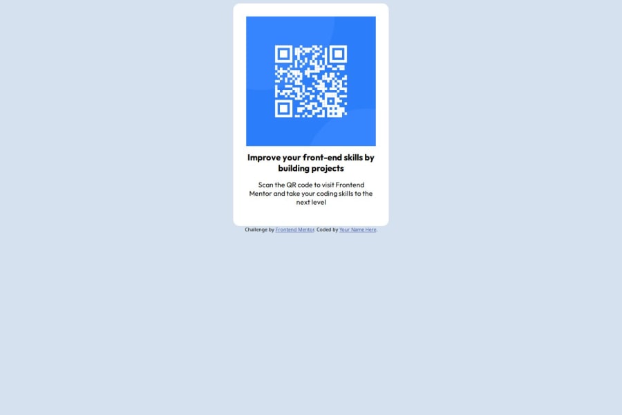
I initially had trouble centering the QR Code but I went out on my own to search how to do it and eventually was able to find the code I was looking for. I'm proud of how it turned out.
What challenges did you encounter, and how did you overcome them?See above.
What specific areas of your project would you like help with?I'm curious to see how others did this code. As mentioned, I'm proud of how it turned out but I want to know how it could be easier.
Community feedback
- @jcuacuasPosted 6 months ago
Great job on the project! I think using the "margin: auto; property" was a good solution and its something I did myself. I think the code is pretty well structured but could use a few improvements. I like that you added a class to the qr code image and the container, but I think it would be better if you selected the css classes in the stylesheet. Selecting ".container" instead of "div.container" would make it more semantic. I would also use a class for the h1 element and p instead of selecting the element itself in the css. I personally use the BEM naming convention because using a convention makes the css more readable and less prone to errors. You can take a look at https://github.com/awesome-css-group/awesome-css#naming-conventions--methodologies-bulb for some naming conventions. I recommend taking a look at BEM or Kickoff CSS for a naming convention. Making code semantic is important in bigger projects, where it can be harder to debug or change things around. Also you can use "margin: 0 auto;" instead of doing "margin-right: auto; margin-left: auto;" on the image and it would do the same thing.
Some smaller changes I would make is to add a margin to the top of the container to keep it centered vertically. Also a border-radius on the qr code image would look good. Great work!Marked as helpful1@BoffdubPosted 6 months ago@jcuacuas Thanks Jose. That all makes sense and something I'll make sure to use in the future.
0
Please log in to post a comment
Log in with GitHubJoin our Discord community
Join thousands of Frontend Mentor community members taking the challenges, sharing resources, helping each other, and chatting about all things front-end!
Join our Discord
