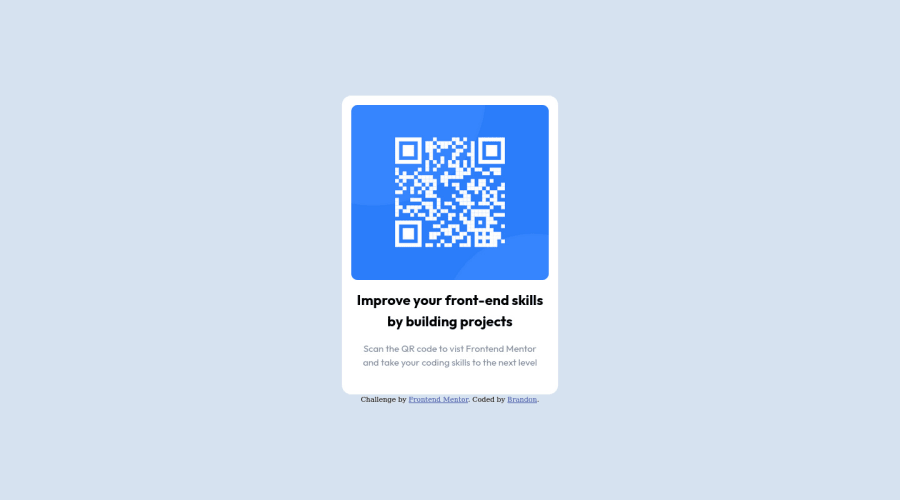
Design comparison
Solution retrospective
Since i found that this is pretty much the same concept as the preview card challenge, most of it was just reusable. Although I was having problems getting my text to drop down a line without increasing the font size.
Community feedback
- @vanzasetiaPosted over 2 years ago
Hi, Brandon! 👋
Congratulations on finishing this challenge! 🎉
I notice that on mobile view, the card is getting squished. It happens because of the
width: 24%;
on the.container
. I would recommend only setting amax-width
with fixed value, likepx
(or even betterrem
unit). By default,div
element would have100%
width. So, all you need to do is to setmax-width
to limit how much width the card can have. This way, the card is allowed to grow until a specific amount but still allow it to shrink if needed.For the text content, you can play around with the
padding
of the card. You can try to increase it slowly until the text content breaks into two lines the way you want. Of course, you can combine it by changing thefont-size
and thepadding
of the card until it looks similar to the design.That's it! I hope this helps. 😊
Marked as helpful1@oallelsefailoPosted over 2 years ago@vanzasetia
Thanks for taking the time to review it. I completed this late last night and I went through the design and saw desktop and mobile looked the same and in my incoherent mind I didn't even think to resize the screen to see if it changed.
Changing the
max-width
torem
even fixed the text issue I had.0@vanzasetiaPosted over 2 years ago@oallelsefailo
You are welcome! 👍
Glad to know that you were able to fix the issue! 👏
0
Please log in to post a comment
Log in with GitHubJoin our Discord community
Join thousands of Frontend Mentor community members taking the challenges, sharing resources, helping each other, and chatting about all things front-end!
Join our Discord