Submitted almost 2 years ago
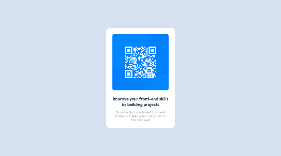
QR Code with additional changes to responsiveness and accessibility
@liammalby
Design comparison
SolutionDesign
Community feedback
- @rostyslav-nazarenkoPosted almost 2 years ago
Hi! Great code!
I found only a few issues with using absolute and relative units. I will explain as much as I can but here is a great article if you need more information.
- Generally, you would want to use relative units like
emorrem. Usingremis easier as it is based on the root font size which is by default 16px, but users can change it in the browser settings.emis based on the parent element font size that way it is harder to set precise font size, read more in the article. - In your code you set
body { font-size: 15pt; }.ptis an absolute unit, which is used in print. In this case setfont-sizeto0,9375rem(15 / 16, 15 is your target size, and 16 is the default). - But then you set the font size of the
pelement to1rem(and you override previous rule) which is 16px (by default) andh1to22px. This makespchange its font size according to user preferences andh1would be stuck and not change its font size. line-height: calc(1.27 * var(--header-font-size));andline-heigth: 1.27;mean exactly the same.
So, generally, people set
fontin rem to thebodyelement which makes other elements inherit frombodyMarked as helpful1@liammalbyPosted almost 2 years ago@rostyslav-nazarenko thank you for your feedback! I have hopefully made some adjustments to the way I do things in the most recent challenge I completed :)
0 - Generally, you would want to use relative units like
Please log in to post a comment
Log in with GitHubJoin our Discord community
Join thousands of Frontend Mentor community members taking the challenges, sharing resources, helping each other, and chatting about all things front-end!
Join our Discord
