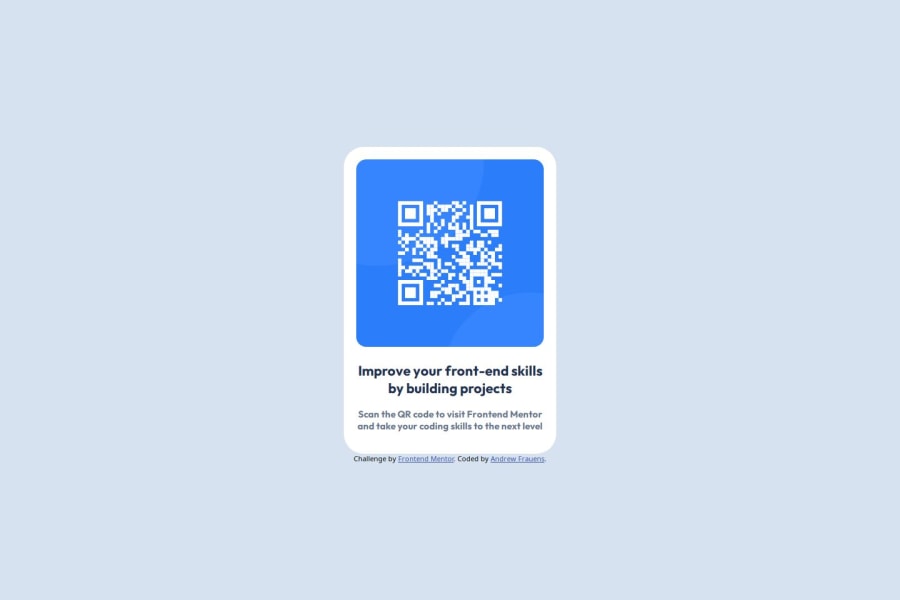
Design comparison
Solution retrospective
I'm happy I was able to do it mostly by reminding myself of specific property names rather than being totally lost on how things could be structured.
Next time I would consider actually splitting my css into its own file, but I liked seeing how I felt about inline styles anyway
What challenges did you encounter, and how did you overcome them?centering the card vertically was a bit of a struggle that I had to google and find a few solutions for
What specific areas of your project would you like help with?I wasn't sure exactly the best way to decide for this the exact sizes/placements of the text. I thought the design guide said but it looks different than the image.
Community feedback
- @shikurassefaPosted 5 months ago
Hey @AndrooFrowns good try,but here is a suggestion you have to consider 1 you should have to include semantic Html element 2 your code is not well structured and organized
0
Please log in to post a comment
Log in with GitHubJoin our Discord community
Join thousands of Frontend Mentor community members taking the challenges, sharing resources, helping each other, and chatting about all things front-end!
Join our Discord
