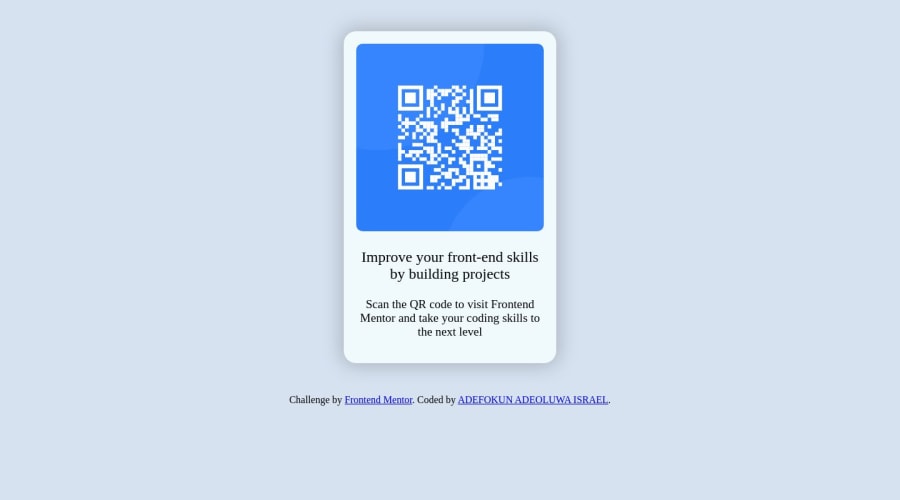
Design comparison
SolutionDesign
Community feedback
- @yashgjoshi20Posted over 1 year ago
Hey well done for completed this challenge😁
I have some suggestions to help you to improve your solution :
- You should add an <main> tag after body and before the div tags.
- Instead of using <div class="container">, you should use <main class="container">
- The <main> tag specifies the main content of a document.
- You should put the <div class="attribution"> outside the <main> tag
- Then replace the <div> tag by semantic tag <footer>
- footer can contain information about author, copyright etc.
HTML
<body>
    <main class="container">
         <div>
         </div>
    </main>

    <footer class="attribution">
     ....
    </footer>
</body>
I hope you'll find this helpful, and your solutions is really good. 😌
0 - @feliceNicolasBarcellonaPosted over 1 year ago
it seems that the font is not working as it should, try importing the font as suggested by google.
In the html
<link rel="preconnect" href="https://fonts.googleapis.com"> <link rel="preconnect" href="https://fonts.gstatic.com" crossorigin> <link href="https://fonts.googleapis.com/css2?family=Outfit:wght@400;700&display=swap" rel="stylesheet">or in the css file
@import url('https://fonts.googleapis.com/css2?family=Outfit:wght@400;700&display=swap');
0 - @Danish49Posted over 1 year ago
You have used different fonts but it still looks pretty 😍 Nicely done.
0
Please log in to post a comment
Log in with GitHubJoin our Discord community
Join thousands of Frontend Mentor community members taking the challenges, sharing resources, helping each other, and chatting about all things front-end!
Join our Discord
