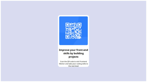
Submitted over 1 year agoA solution to the QR code component challenge
QR code website using CSS display settings
@Dirk-nl

Solution retrospective
What are you most proud of, and what would you do differently next time?
I am most proud of handling the display setting in css and next time I would probally start using a container from the beginning
What challenges did you encounter, and how did you overcome them?It was hard to center the qr code box, however, while reading css documentation I found the solution in making a container box and aligning items within that box
Code
Loading...
Please log in to post a comment
Log in with GitHubCommunity feedback
No feedback yet. Be the first to give feedback on Dirk-nl's solution.
Join our Discord community
Join thousands of Frontend Mentor community members taking the challenges, sharing resources, helping each other, and chatting about all things front-end!
Join our Discord