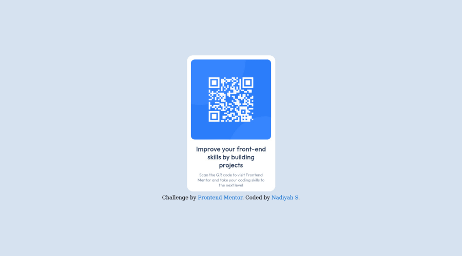
QR Code Website for Frontend Mentor using CSS and HTML
Design comparison
Solution retrospective
While building the project I was struggling with centering the divs at the verticle center of the webpage. I ended up using a margin, however, that did not center the divs. Any suggestions?
Community feedback
- @vanzasetiaPosted over 1 year ago
Hi, NadiyahRSerrano! ๐
Congratulations on completing your first Frontend Mentor challenge! ๐
You should make "Improve your front-end skills by building projects" as an
<h1>
instead of<p>
.You should use a CSS reset whenever you start a new project. This can help you set the styling foundation easily. My recommendation โ A Modern CSS Reset | Andy Bell
The alternative text should not be hyphenatedโlike class names. It should be in a human-readable format.
The alternative text of the QR code should describe its purpose. A good example can be "QR code to frontendmentor.io". This answers two questions: "What is the image" and "What is the purpose of the QR code". This way, the users know what will happen after they scan the QR code.
You should never use
px
unit for font sizes. Userem
orem
instead. Relative units such asrem
andem
can adapt when the users change the browser's font size setting. Learn more โ Why you should never use px to set font-size in CSSI hope you find this useful. Happy coding! ๐
Marked as helpful2 - @MelvinAguilarPosted over 1 year ago
Hello there ๐. Good job on completing the challenge !
I have some suggestions about your code that might interest you.
CSS ๐จ:
Using flexbox layout:
body { min-height: 100vh; display: flex; flex-direction: column; justify-content: center; align-items: center; }
Using grid layout:
body { min-height: 100vh; display: grid; place-content: center; }
You can read more about centering in CSS here ๐.
I hope you find it useful! ๐
Happy coding!
Marked as helpful1@NadiyahRSerranoPosted over 1 year ago@MelvinAguilar Thank you for your response, this helped a bunch and I learned something new! Much appreciated๐
1 - @AgbortokoPosted over 1 year ago
- HTML5 elements such as
<main>
,<nav>
,<header>
,<footer>
,<section
>,<aside>
act as landmarks, or special regions on the page to which screen readers and other assistive technologies can jump. By using landmark elements, you can dramatically improve the navigation experience on your site for users of assistive technology (Users with disabilities) .
You can use the
<div>
for sub items within landmarks like<section>
. In other words for containers or sections in your HTML you can use the<section>
tag if you want to nest in sub items<div>
.Landmarks such as the
<section>
may actually require that you specify a heading within. In other words if the section has no heading it may throw an error when checked by an accessibility tool.It is advisable that you place all your main site content in a landmark element
<main>
Here is an Accessibility Evaluation Tool to check your webpage for any errors or warnings related to landmarks.There exist an attribution
<div>
that comes with the frontendmentor starter kit. You will have to wrap this<div>
in a<footer>
tagRead
-
W3schools Accessibility Landmarks Notes for more information.
-
MDN Web docs notes for more information.
I hope you find the above solution useful! ๐ Nevertheless, the solution you submitted is great! Happy coding!
0@vanzasetiaPosted over 1 year ago@Agbortoko
Hi, Agbortoko Arreychuck! ๐
<section>
is not a landmark element.<section>
does not have meaning unless it is labeled by a heading tag usingaria-labelledby
. So, without being labeled properly it is the same as<div>
โno semantic meaning.You can see the following web page to learn more about the semantic meaning of each element.
0 - HTML5 elements such as
Please log in to post a comment
Log in with GitHubJoin our Discord community
Join thousands of Frontend Mentor community members taking the challenges, sharing resources, helping each other, and chatting about all things front-end!
Join our Discord