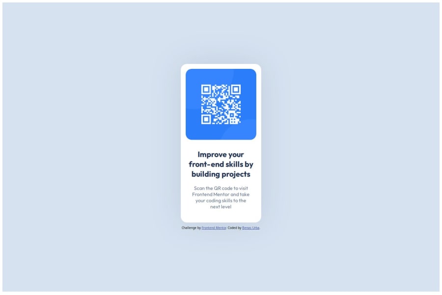
Design comparison
Solution retrospective
It was my first introduction to how flexboxes work, I also got to experience the changes and differences between different media views and was forced to make the website adaptable to various medias.
What challenges did you encounter, and how did you overcome them?Had some difficulty in getting the right sizes of the components to fit on the screens of different medias. I have tested this on my windows laptop and my iPhone 11. Various other dimensions were tested using Google's developers tools.
What specific areas of your project would you like help with?Still need more help with how medias work and operate to ensure that every/majority of devices have good view of the website. Moreover, will want more experience with different display types like flexbox and grids.
Community feedback
- @R3ndrexPosted about 2 months ago
You can use width:min(absolute units, relative units) or smth like for responsive display
0
Please log in to post a comment
Log in with GitHubJoin our Discord community
Join thousands of Frontend Mentor community members taking the challenges, sharing resources, helping each other, and chatting about all things front-end!
Join our Discord
