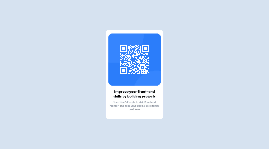
Design comparison
Solution retrospective
I'm not quite sure about RWD in this project and if it is correct, let me know how do you see it guys. :)
Community feedback
- @shalash23Posted about 2 years ago
Nice job there.
I've read the media-queries on your CSS and I've found that you've used max-width parameter with it. Which makes me take a wild guess that you went with desktop-first?
If so, what really helped me is writing the HTML using the desktop design first so I can write according to the maximum complexity. Yet when I start styling, I go mobile first. This technique really made RWD to me much tolerable than before and now I actually kind of enjoy it.
Also using em, rem, etc... instead of hard-coded values makes your life much easier on the long-run. So take the time to get a grasp on those units.
Good luck and nice job
Marked as helpful0
Please log in to post a comment
Log in with GitHubJoin our Discord community
Join thousands of Frontend Mentor community members taking the challenges, sharing resources, helping each other, and chatting about all things front-end!
Join our Discord
