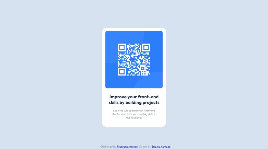
Design comparison
SolutionDesign
Solution retrospective
What are you most proud of, and what would you do differently next time?
I am proud that I was able to create this project in just a few hours. I have coded in these languages before, but not well and not for a very long time. Next time, I will try to apply these new skills to break down the problem in a more orderly way instead of all willy nilly.
What challenges did you encounter, and how did you overcome them?I encountered problems with the spacing, padding, Google Fonts -- even setting up the project was quite a challenge for me. I overcame them by searching my problems on Google and was able to troubleshoot solutions.
What specific areas of your project would you like help with?Here are a few things I would like help with:
- How can I make my code more efficient/readable? Are there things that I did that seem convoluted or could be done in a simpler way? Are my names descriptive enough?
- What could I have done better to get a pixel-perfect site? I had to play around with a lot of the pixel amounts and wasn't sure if I should be doing something to get padding that perfectly matched the Figma file. (Ex: Look at my "card" class in my CSS file. I just chose 14px because it looked somewhat right. What could I have done to get the right value instead of guessing?)
Community feedback
Please log in to post a comment
Log in with GitHubJoin our Discord community
Join thousands of Frontend Mentor community members taking the challenges, sharing resources, helping each other, and chatting about all things front-end!
Join our Discord
