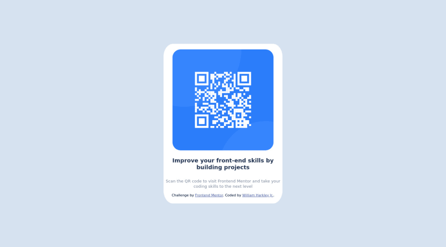
Design comparison
SolutionDesign
Solution retrospective
At first all the folders seemed intimidating. But once I started reading the readme.md and setting up the font/colors, everything was auto pilot. I finished in under 2 hrs. This is so motivating!
Community feedback
- @denieldenPosted over 2 years ago
Hi William, good job! I took some time to look at your code and have some ideas for improving it:
- add
main
tag and wrap the card for Accessibility - to make it look as close to the design as possible set
width: 20rem and border-radius: 1rem
to.qrbadge
class - remove all
margin
from.qrbadge
class - try to use flexbox to the body for center the card. Read here -> best flex guide
- after, add
min-height: 100vh
to body because Flexbox aligns child items to the size of the parent container
Overall you did well 😉
Hope this help and happy coding!
Marked as helpful1@WillHarkleyPosted over 2 years ago@denielden will do! Thank you for the tips! This is stuff that some of my tutorials skipped.
1 - add
- @AbdelrhmanX7Posted over 2 years ago
hi you have problem to show your project please remove readme.md file to be able to show your project on front end mentor
Marked as helpful1
Please log in to post a comment
Log in with GitHubJoin our Discord community
Join thousands of Frontend Mentor community members taking the challenges, sharing resources, helping each other, and chatting about all things front-end!
Join our Discord