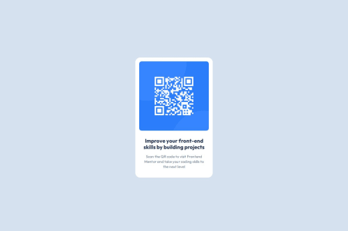
Submitted over 1 year agoA solution to the QR code component challenge
QR Code Webpage
accessibility
@Sumta4real

Solution retrospective
What are you most proud of, and what would you do differently next time?
I have mastered the flex layout principle as well as using custom fonts within my webpage and I can conveniently use it moving forward
What challenges did you encounter, and how did you overcome them?I had challenge centering the div horizontally and vertically I also had challenge with mastering spacing and margins I surfed the internet and got useful materials that helped reinforced the knowledge and I was able to navigate the challenge
What specific areas of your project would you like help with?None
Code
Loading...
Please log in to post a comment
Log in with GitHubCommunity feedback
No feedback yet. Be the first to give feedback on Taiwo Sumayyah's solution.
Join our Discord community
Join thousands of Frontend Mentor community members taking the challenges, sharing resources, helping each other, and chatting about all things front-end!
Join our Discord