Not Found
Not Found
Not Found
Not Found
Not Found
Not Found
Not Found
Not Found
Not Found
Not Found
Not Found
Not Found
Not Found
Not Found
Not Found
Not Found
Not Found
Not Found
Not Found
Not Found

Submitted

QR Code Web

@Spectexz

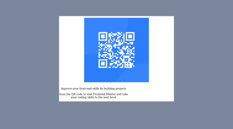
Desktop design screenshot for the QR code component coding challenge

This is a solution for...

  • HTML
  • CSS
1newbie
View challenge

Design comparison


SolutionDesign

Solution retrospective


Hi, i am very new to programming. I have been watching about front end. However I did try to make the web page. However I found a difficulty on making the image to the center, making the container, and still confused about using the flexbox, display, etc.

Community feedback

@0xabdulkhaliq

Posted

Hello there 👋. Congratulations on successfully completing your first challenge! 🎉

  • I have other recommendations regarding your code that I believe will be of great interest to you.

HTML 🏷️:

  • Use semantic elements such as <main> instead of <div class="container"> to improve accessibility and organization of your page.
  • Use HTML5 semantic elements such as <header>, <nav>, <main>, <aside>, and <footer> to define these sections

I hope you find it useful! 😄 Above all, the solution you submitted is great!

Happy coding!

1

@Spectexz

Posted

@0xAbdulKhalid Thankyou very much for the information. It seems like I have a long way to go. Thankyou for the information, I will surely keep it in my notes and mind. :D

0
Hassia Issah 50,690

@Hassiai

Posted

Replace <div class="container"> with the main tag and <p class="improve-msg"> with <h1> to fix the accessibility issue. click here for more on web-accessibility and semantic html

To center .container on the page using flexbox or grid, add min-height:100vh; display: flex; align-items: center: justify-content: center; or min-height:100vh; display: grid place-items: center to the body.

USING FLEXBOX:
body{
min-height: 100vh;
display: flex;
align-items: center;
justify-content: center;
}
USING GRID:
body{
min-height: 100vh;
display: grid;
place-items: center;
}

For a responsive content give .container a fixed max-width value and padding value for all the sidesmax-width:320px padding:16px and a border-radius value.

Give h1 and p the same font-size of 15px which is 0.9375rem and the same margin-left, margin-right and margin-top values. Give p a margin bottom value.

Give the img a max-width of 100% instead of a width and height value.

Use relative units like rem or em as unit for the padding, margin, width values and preferably rem for the font-size values, instead of using px which is an absolute unit. For more on CSS units Click here Hope am helpful.

Well done for completing this challenge. HAPPY CODING

0

Please log in to post a comment

Log in with GitHub
Discord logo

Join our Discord community

Join thousands of Frontend Mentor community members taking the challenges, sharing resources, helping each other, and chatting about all things front-end!

Join our Discord