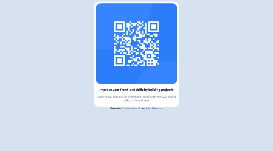
Design comparison
SolutionDesign
Solution retrospective
Feedback welcome, especially feedback on how to make the css and html flow together better and possibly use less of it
Community feedback
- @Bakek-langPosted over 1 year ago
Congratulations on finishing this project!
I have a few suggestions on how you can make your solution include semantic HMTL and improve between the CSS and HTML.
- Use
<main>instead of<div>on the cardboard and<footer>instead of<div>on the footer. - To have more control over the CSS i would recommend using a stylesheet just for CSS, instead of applying the CSS inside of index.html
- Use flex or grid to place the main section to the middle of the page
- You can also place your name/alias at the bottom of the page where it says "Your Name Here"
Well done with your solution, hope this helps.
Marked as helpful1 - Use
Please log in to post a comment
Log in with GitHubJoin our Discord community
Join thousands of Frontend Mentor community members taking the challenges, sharing resources, helping each other, and chatting about all things front-end!
Join our Discord
