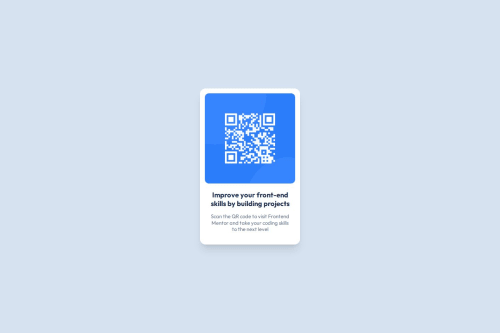
Design comparison
Solution retrospective
I had a lot of fun working on this first project. I've always been curious about Tailwind and thought this would be a good time to try it.
After completing the challenge, I then spent some time creating a website where I will easily be able to share future front-end mentor challenges. I ended up going with Github Pages for its ease of use.
What challenges did you encounter, and how did you overcome them?I found it enjoyable but strange to work with Tailwind's utility classes. This was especially true when trying to recreate the QR code challenge with some of its exact pixel measures.
What specific areas of your project would you like help with?In general, I am more of a server-side person but I want to improve my front-end skills. The main thing I need help with is learning to "see". Aka, what is still not right about my design? To my eyes, it looks pretty good, but I feel I'm still missing some more subtle visual things.
Community feedback
- @CarlHummPosted 2 days ago
Hi Beadle
Glad to hear you enjoyed tailwind and got the hang of it - I'm yet to try it out myself.
I'm less back-end more designer, so when I look at the design and your current solution a few things stand out to me.
- Font family is different to design (Segoe UI is inherited from HTML, font-outfit class has no affect)
- Line height for heading and paragraph is different to design (too much space)
- Colour is different for heading (Black instead of slate blue)
- Spacing is different for card. (Lack of bottom padding on card)
- Card size is slightly smaller than design
- Card box shadow is present in design.
A big part of 'learning to see' is understanding visual design, why things look the way they do and what purpose certain graphical design decisions have - that and regular exposure and practice!
Practice noticing spacing and subtle design decisions in your everyday browsing
So next time you're on spotify, youtube, or whatever just try look for the blocks of information, notice the spacing between not just the text but also the sections. See how proximity is used to seperate and organise information, how size is used to create emphasis, this will help you understand other peoples designs and create some of your very own. Although I wouldn't worry too much as in the real world you would usually be working from a design file anyway.
Some extra resources (Pure Design Theory)
Other than the design, I think the following could also help.
- Set a minimum height for card instead of fixed height - as your card shrinks your text width shrinks, wraps and increases in height. If the cards height is fixed then this wrapped text will grow to a greater height and overflow the container. If you set a minimum value this allows the text and content to dictate the maximum height instead.
Well done and good luck on your future challenges! If you need any help feel free to ask me here, or the helpful community via the Frontend Mentor Discord
Marked as helpful0
Please log in to post a comment
Log in with GitHubJoin our Discord community
Join thousands of Frontend Mentor community members taking the challenges, sharing resources, helping each other, and chatting about all things front-end!
Join our Discord