Design comparison
SolutionDesign
Solution retrospective
What are you most proud of, and what would you do differently next time?
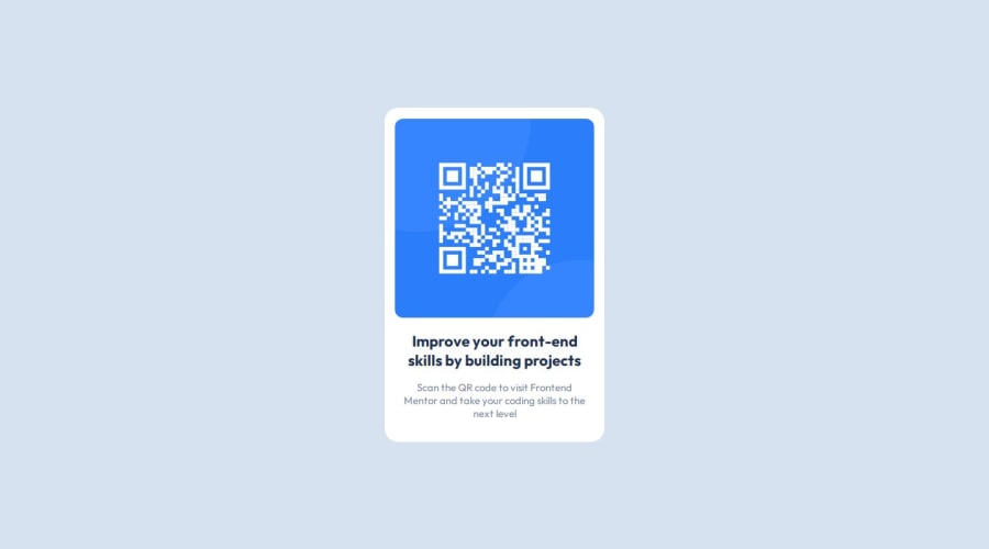
I used CSS flexbox to build the layout of the web page which I learnt just a week ago, so this project helped me practice my HTML and CSS skills. If I get the opportunity to do this project again, I would like to style it using Tailwind CSS.
What challenges did you encounter, and how did you overcome them?- As this was a pretty simple project, I didn't encounter any challenges as such in coming up with the code.
- I didn't use the design files on purpose to see the exact font-size and spacing, so that it can serve as a practice for next projects in which I don't have access to these files, so it was a bit challenging to guess the padding, sizes and related stuff, in order to make it look as close to the design as possible.
- What other efficient approaches can I use to design the same layout?
- Any feedback on how my code can be improved in terms of code quality and accessibility?
Community feedback
Please log in to post a comment
Log in with GitHubJoin our Discord community
Join thousands of Frontend Mentor community members taking the challenges, sharing resources, helping each other, and chatting about all things front-end!
Join our Discord
