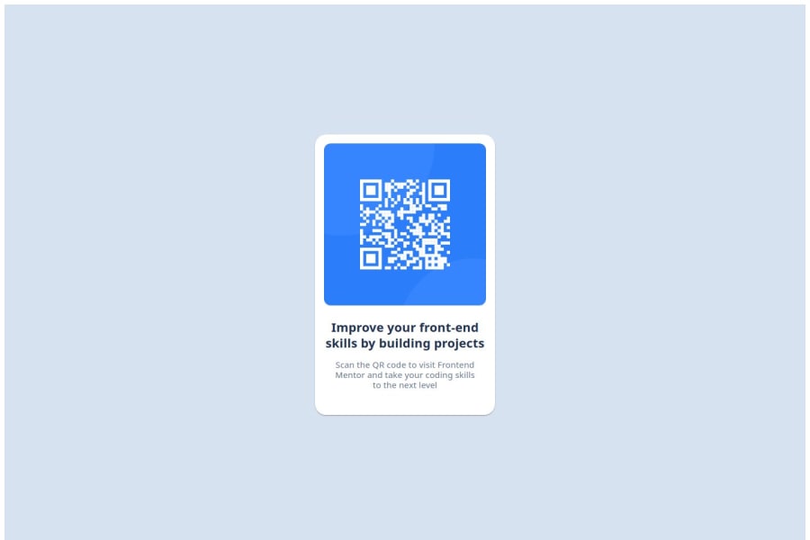
QR Code using Next.js and Material UI
Design comparison
Solution retrospective
I am proud of how close I came to the design. It was a challenge to match the design CSS for me, but I used online material to read more about how I can do it. Using Material-UI made things a little bit easier because I didn't need to build components from scratch. I want to learn to build components from scratch though just for the basics, so that's what I am going to focus on in my next project.
What challenges did you encounter, and how did you overcome them?I used the Next.js framework because I wanted to learn about it too, but when I tried deploying the project to Github Pages, the images weren't loading. I still haven't figured out how to fix it. I did find one YouTuber who fixed it, but they are using next pages while I am using next app. I am sure if I continue browsing the internet I will find a solution.
I want to know an easy way to know about what CSS to use.
Community feedback
Please log in to post a comment
Log in with GitHubJoin our Discord community
Join thousands of Frontend Mentor community members taking the challenges, sharing resources, helping each other, and chatting about all things front-end!
Join our Discord
