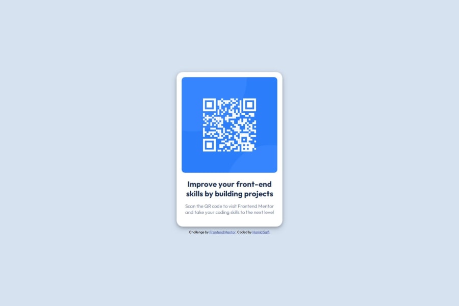


Design comparison

Solution retrospective
To very honest, I am proud that it turned out similar to what was expected. Initially, I was doubting myself whether I will be able to complete it. But it really became so accurate. I am really happy
What challenges did you encounter, and how did you overcome them?Put all elements together was a major challenge for me. But I tired to understand how display grid & flex works. As well as positions, which helped me a lot. And responsiveness was also a bit of an issue but that got solved quickly.
What specific areas of your project would you like help with?Specially the media query for different display
Community feedback
- P@Islandstone89Posted 25 days ago
Hi Hamid, good job.
I have some suggestions which I hope you find clear and helpful - good luck :)
HTML:
-
The alt text must also say where it leads(the frontendmentor website). A good alt text would be "QR code leading to the Frontend Mentor website."
-
Change
.attributionto a<footer>, and use<p>for the text inside. The<footer>must be outside of the<main>- both should be direct children of the<body>.
CSS:
-
Make a habit of including a modern CSS Reset at the top of the stylesheet.
-
I recommend adding a bit of
padding, for example16px, on thebody, to ensure the card doesn't touch the edges on small screens. -
On the
body, changeheighttomin-height: 100svh- this way, the content will not get cut off if it grows beneath the viewport. -
Descendant selectors like
.des-container pincrease specificity, making the styles harder to override. It's best practice to instead give elements a class, and use that as the selector. -
Remove the
widthinpxon the card. We rarely want to give a component a fixed size, as we need it to grow and shrink according to the screen size. -
We do want to limit the width of the card, so it doesn't get too wide on larger screens. To solve this issue, give the card a
max-widthof around20rem. -
font-sizeon.attributionmust also be in rem. -
Since all of the text should be centered, you only need to set
text-align: centeron the body, and remove it elsewhere. The children will inherit the value. -
Paragraphs have a default value of
font-weight: 400, so there is no need to declare it. -
The paragraph text has poor contrast. Inspecting it in DevTools shows a contrast ratio of
3.63, lower than the Web Content Accessibility Guidelines minimum requirement of4.5. Changingcolor: hsl(220, 15%, 55%);tocolor: hsl(220, 15%, 45%);gives it a contrast ratio of5.2, which is acceptable. -
On the image, add
height: autoand changewidthtomax-width: 100%- the max-width prevents it from overflowing its container. Without this, an image would overflow if its intrinsic size is wider than the container.max-width: 100%makes the image shrink to fit inside its container. -
As the design doesn't change, there is no need for any media queries. When you do need them, they should be in
remorem, notpx. Also, it is common practice to do mobile styles first and use media queries for larger screens.
Marked as helpful1@hamidsaifi8Posted 24 days ago@Islandstone89 Thanks for your valuable feedback. I'll carry it.
1 -

Please log in to post a comment
Log in with GitHub
Join our Discord community
Join thousands of Frontend Mentor community members taking the challenges, sharing resources, helping each other, and chatting about all things front-end!
Join our Discord