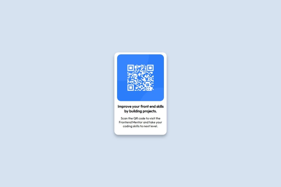


Design comparison

Solution retrospective
I am proud of to implement my learning of flexbox and grid for styling a responsive design. I got to know how to import custom fonts and use them in styling also how to host a website on Netlify. Next time i want to add dynamic interactions using javaScript as well.
What challenges did you encounter, and how did you overcome them?I encounter challenges when importing custom fonts then i googled up and resolved those issues. I also faced issue centering the Qr- code and resolved it using flex,grid and top margin. Although i think there might be a better approach to get it done more easily. i will look for other methods as well.
What specific areas of your project would you like help with?- I want to know is can we use div to complete this task or is it more better than main or not ?
- i also want to know how can i center my elements in a better way?
Community feedback
- @beowulf1958Posted 3 months ago
Congratulations on completing this challenge. I have a few suggestions:
I noticed that the text breaks out of its container. You can fix this by removing the
height: 400px;from the main section and allowing the container to adjust to the content. Use fixed heights sparingly.Also the text is a bit cramped. You can fix this by adding
row-gap: 10px;to the main section. Now the elements are neatly spaced.You might want to reduce the font size on the <p> to 16px. This gives a bit of contrast to the title.
Again, great job and keep on coding.
Marked as helpful0@mariamkhan04Posted 3 months ago@beowulf1958 Thank you so much for pointing this out! I really appreciate your feedback.
I removed the height: 400px; from the main section, reduced the font size of the <p> to 16px as you suggested. These changes made the design more flexible and visually appealing. Thanks again for your valuable input—it truly helped improve the overall look! 🙌
0 - @alaa-mekibesPosted 3 months ago
Well done
-
Push your files directly to GitHub instead of putting them in a folder and then pushing it.
-
Use CSS variables to improve maintainability, like this:
:root { --bg-color: hsl(210, 46%, 95%); /* Add your other colors here */ } body { background-color: var(--bg-color); /* Other properties */ }-
The project is not very big, so I think using semantic elements like
<section>is not essential. -
Add
min-height: 100vhto achieve a full-screen layout, like this:
body {
    background-color: hsl(212, 45%, 89%);
    display: flex;
    justify-content: center;
    align-items: center;
    min-height: 100vh;
}
Great job so far, keep pushing forward, you're doing amazing!
Marked as helpful0@mariamkhan04Posted 3 months ago@alaa-mekibes Thank you so much for your feedback! 😊 I set the min-height to 100vh, and now the elements are beautifully centered and well-adjusted. I'll definitely try out using CSS variables to improve maintainability in future projects. Your suggestions are super helpful—thank you for encouraging me to keep improving! 🙌
1 -
- P@djlaw90Posted 3 months ago
Looks good to me! I think you probably just could use flexbox for this, grid is great for more complex layouts from what i've heard. I just realized there's a box shadow on the QR box I forgot on mine too ><; Great work!
Marked as helpful0@mariamkhan04Posted 3 months ago@djlaw90 Thank you so much! I honestly didn’t notice the box shadow either until you pointed it out—great eye! And you're absolutely right, I’ll try sticking to flexbox for layouts like this in the future. Really appreciate your feedback!
0


Please log in to post a comment
Log in with GitHub
Join our Discord community
Join thousands of Frontend Mentor community members taking the challenges, sharing resources, helping each other, and chatting about all things front-end!
Join our Discord