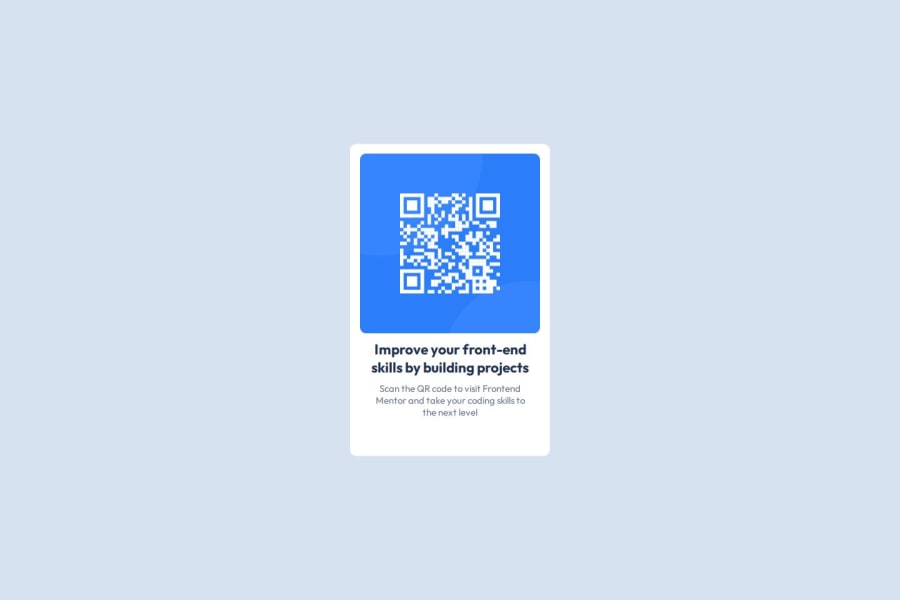
Design comparison
SolutionDesign
Community feedback
- @AnGeLicozPosted 23 days ago
Looks almost indentical! Maybe try to use margin-bottom on each element to create custom spaces.
0 - @mizolfPosted 23 days ago
Try to use viewport height in body, center the container with flexbox, correct class names (.qr-description top > .qr-description-title, .qr-description bottom > .qr-description-text), maybe replace fixed .qr-image width /w width: 100% it will stretch within the container it is inside
0
Please log in to post a comment
Log in with GitHubJoin our Discord community
Join thousands of Frontend Mentor community members taking the challenges, sharing resources, helping each other, and chatting about all things front-end!
Join our Discord
