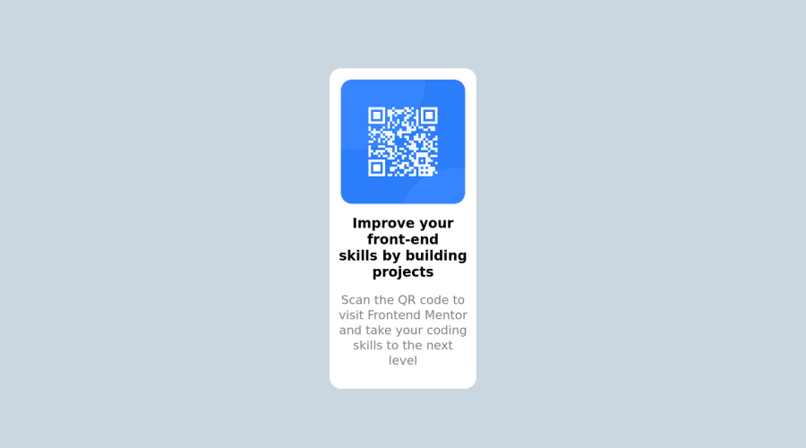
Design comparison
Solution retrospective
Hi, it's my first time when I've tried to do something also mobile-friendly. That's why i'm unsure about practices i've used. I suppose there are better techniques so feel free to share them with me.
Community feedback
- @HassiaiPosted almost 2 years ago
Replace <div id="cont"> with the main tag and <b> with <h1> to fix the accessibility issues. click here for more on web-accessibility and semantic html There is no need for the <br> in the html.
To center #qr on the page using flexbox, replace the height in #cont with min-height: 100vh. There is no need to give #cont a width value.
Change the font-size to 15px, this is the font-size for p and h1.
For a responsive content give #qr a fixed max-width value instead of vh width value. e.g: `max-width:320px'. Give the img a max-width of 100% and a border-radius value, the rest are not needed.
Give p and h1 the same margin-left , margin-right and margin-top values and a text-align: center. There is no need to give p a max-width and min-width values.
Use relative units like rem or em as unit for the padding, margin, width values and preferably rem for the font-size values, instead of using px which is an absolute unit. For more on CSS units Click here
Hope am helpful.
Well done for completing this challenge. HAPPY CODING
Marked as helpful0@ArtyracPosted almost 2 years ago@Hassiai Thank you for your feedback. I changed the code and I can see the difference and how the things work.
1
Please log in to post a comment
Log in with GitHubJoin our Discord community
Join thousands of Frontend Mentor community members taking the challenges, sharing resources, helping each other, and chatting about all things front-end!
Join our Discord

