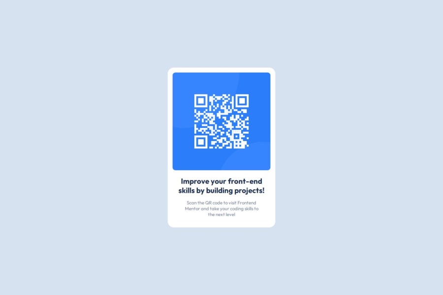
Design comparison
Solution retrospective
I am proud of the time it took for me to finish this project. I think due to my focus on one section at a time helped me manage my overall time spent on this entire project. Moving forward I want to keep this mentality while learning new ways to code efficiently.
What challenges did you encounter, and how did you overcome them?I'd say the only challenge I encountered and still battle with is getting my sizes correct. I find that my card and its borders are either too small or too small. And when I think they are just right, I am told its a bit off.
What specific areas of your project would you like help with?I would like help with sizes and dimensions!
Community feedback
- @AdrianoEscarabotePosted 5 months ago
Hi kingkokopanda, how’s everything? I think your project turned out great! However, I have some feedback that I think might be useful:
Using Flexbox or Grid on the
bodyto center elements ensures a more responsive and adaptive layout, fitting different screen sizes seamlessly. It avoids manual calculations and constant adjustments needed withmargin,padding, or absolute positioning. These techniques provide more consistent alignment and simplify the code.flexbox:
body {
    display: flex;
    justify-content: center;
    align-items:  center;
    min-height: 100vh;
}
grid:
body {
    display: grid;
    place-content: center;
    min-height: 100vh;
}
The rest is amazing.
I hope this is helpful. 👍
Marked as helpful1
Please log in to post a comment
Log in with GitHubJoin our Discord community
Join thousands of Frontend Mentor community members taking the challenges, sharing resources, helping each other, and chatting about all things front-end!
Join our Discord
