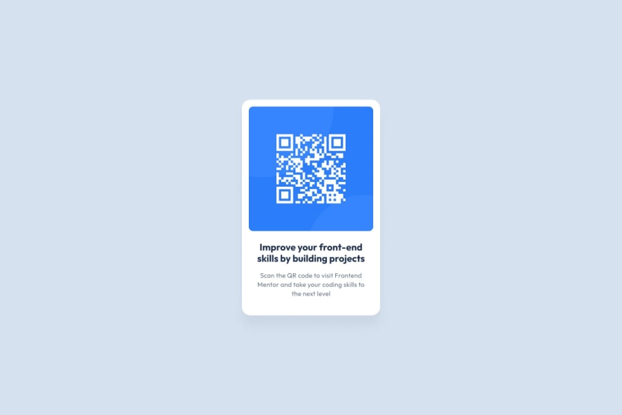
Design comparison
Solution retrospective
I feel my design got pretty close to the solution
What challenges did you encounter, and how did you overcome them?Added more code than necessary, especially the padding. But now its a bit better because I used advantage of the padding shortcut
What specific areas of your project would you like help with?Just general tips, anything can help
Community feedback
- @SvitlanaSuslenkovaPosted about 2 months ago
Hi, it looks nice. You can add flex dirrectly to the body instead of section QR , after that use <main> as main container of your project. So you won't need section QR and container-QR. I think it'll help you to decrease nesting. Hope you found this comment helpful :)
1 - @manamasuPosted about 2 months ago
Great job on completing this task :)
The solution looks pretty close to the design, one observation I would like to share is that the box-shadow effect may be slightly too little. Additionally, although it is not directly related to the task at hand, I recommend considering the use of a template for the README file. This could help you create a quick landing page for users on your GitHub profile specifically for that repository/task. Hope you found that comment helpful and Im excited to see more of your solutions!
0
Please log in to post a comment
Log in with GitHubJoin our Discord community
Join thousands of Frontend Mentor community members taking the challenges, sharing resources, helping each other, and chatting about all things front-end!
Join our Discord