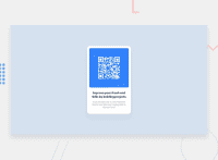
Design comparison
Solution retrospective
In what ways could I have made my page more responsive for different viewports?
Community feedback
- @LipAlex1Posted over 2 years ago
Hi Kieera,
I like your design.
Your current design is static. You can make it responsive by using relative width and height values instead of px. You can giv #card percentage values for width and height. Keep in mind, both width and height percentage values are in relation to the width of the parent element of #card.
In your css you declared the img a flexbox. This doesn't have any effect as display flex turns the container into a flex box with the flex properties affecting the items inside flexcontainers. The img doesn't have any flex items in it.
Also, use em and rem instead of px to responsify your design as em an rem values are fully scalable whereas px are fixed pixel values.
You may want to look at the report as there are also ally issues. It is best practice to use one h1 tag for SEO reasons and to use semantic html (main instead of #card and footer instead of .attribution). Also the ids should be repaced by classes for better reusability of the code.
Happy coding!
Marked as helpful0@kbaseyPosted over 2 years ago@LipAlex1 I appreciate your feedback! I will definitely be utilizing and practicing these methods moving forward.
0
Please log in to post a comment
Log in with GitHubJoin our Discord community
Join thousands of Frontend Mentor community members taking the challenges, sharing resources, helping each other, and chatting about all things front-end!
Join our Discord

