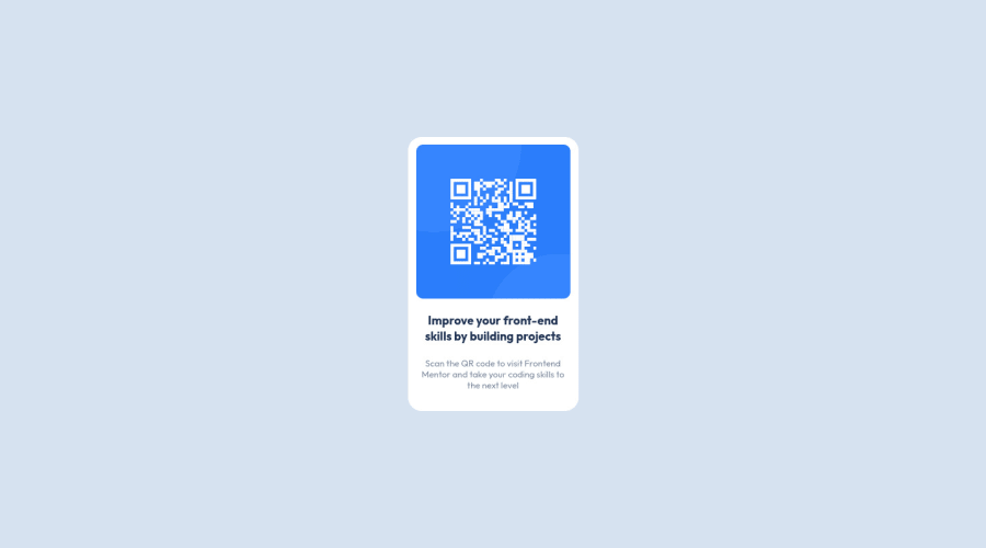
Design comparison
Solution retrospective
Hi Front-End Mentor Fam!
This is my first project submitted! Would love any feedback you can offer!
Areas I was unsure of is my use of Flexbox, and whether there was alternative way to reach the result?
What use of Semantic HTML would be standard practice in a project like this, and is it necessary as it seems quite small scale?
What are other best practice could I use to improve? and any recommendations for extra reading?
(Extra Question - Best method to not go crazy when hitting an obstacle? Lol)
Thanks :)
Community feedback
- @superschoolerPosted over 2 years ago
Great work on your first project, it looks awesome!
I notice you have
.main-container
and only one child inside of it -.qr-box
. Because there's nothing else inside of.main-container
you can do away with it and just stylebody
. I personally love flexbox and use it wherever possible. Grid would be an OK solution as well but I find flexbox to be a bit simpler unless the layout truly requires a grid.I think you did great with the HTML and CSS. You could use
main
instead of div for.main-container
if you wanted to and don't need a div to hold your image. You could simply give the image the.img-cont
class to style it easily.It's not necessarily wrong, but I'm curious why you chose to use H3 for the heading, as opposed to H1, H2, or any other number? Best practice is to only have one
h1
on a page, so if this project were in another website it definitely makes sense to defer to a smaller heading. In the context of this project, There's only one area with heading text so it might make accessibility a bit easier by using H1. Again, this isn't a big deal (as far as I know), I was just curious if there was a reason behind it.I noticed you used pixels for sizing everything. If you want a great resource to start out with, I'd recommend Kevin Powell's REM & EM explanation video on YouTube. This guy's got a lot of great content and a free course to help learn the basics of responsive CSS, unless you've got a great resource you're already using. The main benefit to using rem or em over pixels is that if a user has their default font-size enlarged in their browser settings, your website will scale with it.
As far as getting stuck, read carefully through the code pertaining to your problem, take a walk, watch a YouTube video, and just poke around with it. I'd definitely suggest having a friend who's into web development as well to bounce things off of, or join slack groups (like the one Frontend Mentor has) to post questions if you can't figure it out after you've given it a few good shots.
Hope this helps, if you have any other questions let me know!
Marked as helpful0
Please log in to post a comment
Log in with GitHubJoin our Discord community
Join thousands of Frontend Mentor community members taking the challenges, sharing resources, helping each other, and chatting about all things front-end!
Join our Discord