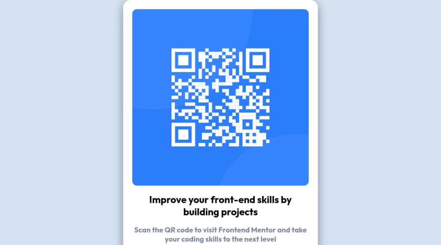
Design comparison
SolutionDesign
Solution retrospective
This is my first challenge that i did and submitted so i hope i did everything right, on that note i'm more than happy to receive feedback on what i should differently and better, thank you :)
Community feedback
- @correlucasPosted over 2 years ago
"👾Hello Petri, congratulations for your solution!
Your solution is almost perfect, but the container size is a bit too big. You need to fix it with
max-width: 320pxand givedisplay: blockto make your image resize with the component.See the code fixes below:
img {
    display: block;
    border-radius: 15px;
    max-width: 100%;
}

.main-content {
    display: flex;
    max-width: 320px;
    /* height: fit-content; */
    border: solid white 30px;
    border-radius: 25px;
    display: flexbox;
    flex-direction: column;
    text-align: center;
    position: absolute;
    top: 0;
    bottom: 0;
    left: 0;
    right: 0;
    margin: auto;
    background-color: white;
    box-shadow: 0px 10px 30px hsl(220deg 15% 55%);
    align-items: center;
    justify-content: center;
}
Hope it helps, happy coding!
Marked as helpful0@Peteksi95Posted over 2 years ago@correlucas Thank you very much, this is very helpful
0
Please log in to post a comment
Log in with GitHubJoin our Discord community
Join thousands of Frontend Mentor community members taking the challenges, sharing resources, helping each other, and chatting about all things front-end!
Join our Discord
