Design comparison
Solution retrospective
This is my first project, so simply being able to finish is what I am most proud of. My main goal for my next project is for the process to go more smoothly, with fewer hiccups where I need to figure basic things out.
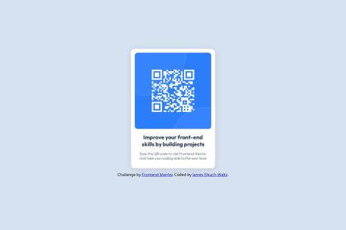
What challenges did you encounter, and how did you overcome them?In terms of the HTML and CSS, figuring out how to get the white card to float and center above the background was one challenge. I had done short HTML and CSS courses from Codecademy, but they didn't cover anything visual like that. I overcame this problem by looking at other solutions to this task and seeing how they did it.
The other main problem I had was connecting and updating on GitHub. I found some of the processes less intuitive and ended up creating and deleting repositories multiple times. In the end, looking at instructions and trying them out multiple times eventually got me to where I could understand and execute the basics.
What specific areas of your project would you like help with?For this project, I'm not looking for any specific help. If there's something I've done that would be better done another way, I'm happy to hear about it and would appreciate general advice.
Community feedback
- @Islandstone89Posted 3 months ago
Good job!
Some suggestions:
HTML:
-
Every webpage needs a
<main>
that wraps all of the content, except for<header>
andfooter>
. This is vital for accessibility, as it helps screen readers identify a page's "main" section. Wrap the card in a<main>
. -
The
<footer>
must not be outside of thebody
. The body is always the parent for all of the content on a page. Your structure should look like this:
<body> <main> <div class="container"></div> </main> <footer> <div class="attribution"></div> </footer> </body>
-
The alt text must also say where it leads(the frontendmentor website). A good alt text would be "QR code leading to the Frontend Mentor website."
-
I would change the heading to a
<h2>
- a page should only have one<h1>
, reserved for the main heading. As this is a card heading, it would likely not be the main heading on a page with several components. -
Footer text must be wrapped in
<p>
.
CSS:
-
Including a CSS Reset at the top is good practice.
-
I like to add
1rem
ofpadding
on thebody
, to ensure the card doesn't touch the edges on small screens. -
On the
body
, removewidth: 100%
- the body is a block element, meaning it takes up the full width by default. -
I would move
font-family
tobody
, so the font is consistent on all of the elements. -
max-width
on the card should be in rem - to convert frompx
torem
, divide the px value by 16. I usually recommend20rem
, which equals320px
. -
font-size
must never be in px. This is a big accessibility issue, as it prevents the font size from scaling with the user's default setting in the browser. Use rem instead. -
Paragraphs have a default value of
font-weight: 400
, so there is no need to declare it. -
Since all of the text should be centered, you only need to set
text-align: center
on the body, and remove it elsewhere. The children will inherit the value. -
It is standard practice to add
display: block
on images - as images are inline elements by default, this can lead to unwanted space underneath an image when it is wrapped in a<div>
.
Marked as helpful0@ElkuchWaltzPosted 3 months agoThis is very helpful, thank you so much for taking the time to comment, @Islandstone89 ! As I'm still early on my coding journey, this kind of information about best practices and why they're followed is really valuable.
1 -
- @nils-dambowyPosted 3 months ago
Looks great! I only think that the solution has a little more padding at the bottom.
Marked as helpful0
Please log in to post a comment
Log in with GitHubJoin our Discord community
Join thousands of Frontend Mentor community members taking the challenges, sharing resources, helping each other, and chatting about all things front-end!
Join our Discord