Design comparison
Solution retrospective
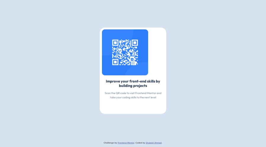
someone check this and tell me how it looks with real challenge and how a container center with css?
Community feedback
- @mecodeshinobiPosted over 1 year ago
To center a container you can use any of these: flex box , css grid or margin-block: auto
1 - @Rafael-UreiPosted over 1 year ago
Oh, hello!
I was checking your code and I have some points to put here: Nice Work, congrats! :) The first thing is that you could use [text-align: center] on the ".container" at CSS to center your <img/> or you can turn the ".container" into [display: flex] and to him the attribute align-items: center, there are many ways to center things that are inside the parents.
The second, to center all the container, you could use position: relative with top:50% left:50% and transform: translate(-50%, -50%) or use margin: auto, or transforming your body tag into display: flex, there are many forms to do it too, even I don't know what is the right, I think that depends of situation.
0@Rafael-UreiPosted over 1 year ago@Rafael-Urei You can also remove the margin-top and margin-bottom from your card.
0
Please log in to post a comment
Log in with GitHubJoin our Discord community
Join thousands of Frontend Mentor community members taking the challenges, sharing resources, helping each other, and chatting about all things front-end!
Join our Discord
