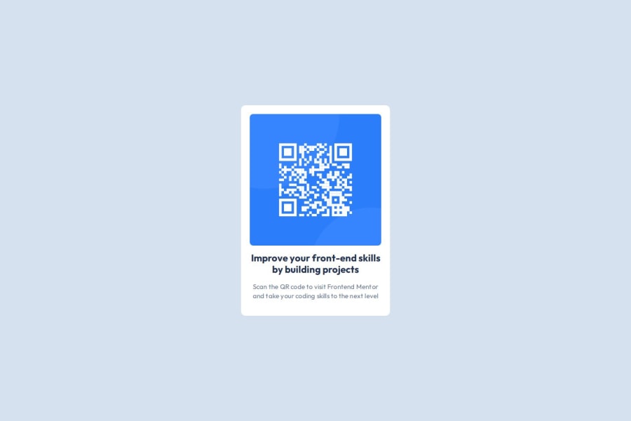
Design comparison
Solution retrospective
I'm proud that in this particular newbie project my foundational knowledge got me through without any trouble. Although I hope and expect to be challenged more in future projects. Next time I would add some extra elements and be creative.
What challenges did you encounter, and how did you overcome them?Nothing was challenging, however I believe my code could be refined and improved.
What specific areas of your project would you like help with?Just to know whether I am on the right track with my code or if there are any problems i am unaware of.
Community feedback
- @grace-snowPosted 7 months ago
This looks good overall. The html and css are well structured, I just have a few recommendations. You should be pleased with this though!
- Give the body min-height 100svh maybe instead of vh. This is a new unit and worth knowing about even if you choose not to use it this time.
- There is no benefit to making this component a flex column. The only reason I can see to do that is if you were using the gap property to create vertical space between child elements but even that is unnecessary. All this does is add extra css lines for no reason.
- Make sure the component max width is in rem not px. That way, users who have a larger default text size won't see their large text squished into a narrow component — the whole layout will scale nicely.
- When we build single component demos like this try to think about the context of how it would be used in a real site. This card would never provide the page title (main heading) so it should not have a h1. Choose a heading level of a lower importance like h2.
Marked as helpful0 - @AdityaGoyal1999Posted 7 months ago
The main elements of your design are identical to the requirement. I'm sure it doesn't have to identical to the design given to us when it comes to pixel values.
Good job!
Marked as helpful0
Please log in to post a comment
Log in with GitHubJoin our Discord community
Join thousands of Frontend Mentor community members taking the challenges, sharing resources, helping each other, and chatting about all things front-end!
Join our Discord
