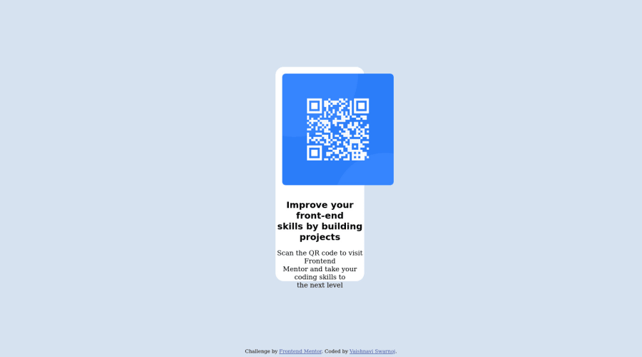
Design comparison
Solution retrospective
Did you find any problem in viewing the QR code in mobile and desktop views?? Any suggestions to improve project code?
Community feedback
- @AdejohOSPosted almost 2 years ago
This is great Vaishnavi, A little tweak here and there can still be done.
The link to your source code is broken, so i can't see your codes.
But i think you can
-Set
img{ width:100%; display:block;}this makes the image responsive and fit the size of it's container.-Having fixed height and width for
.containerwill cause text to overflow when they don't get enough room, so you need to know this.-Happy Coding!!!
Marked as helpful0 - @manjeshrv592Posted almost 2 years ago
Your projects is broken on mobile screen and not well aligned in desktop. We can't help you since your github repo link is not found.
By the looks of it I think you used position absolute which is not necessary in this challenge.
I just completed this challenge you can visit my git repo in my solutions section or any other solution in this community. So you will know what went wrong.
Marked as helpful0
Please log in to post a comment
Log in with GitHubJoin our Discord community
Join thousands of Frontend Mentor community members taking the challenges, sharing resources, helping each other, and chatting about all things front-end!
Join our Discord
