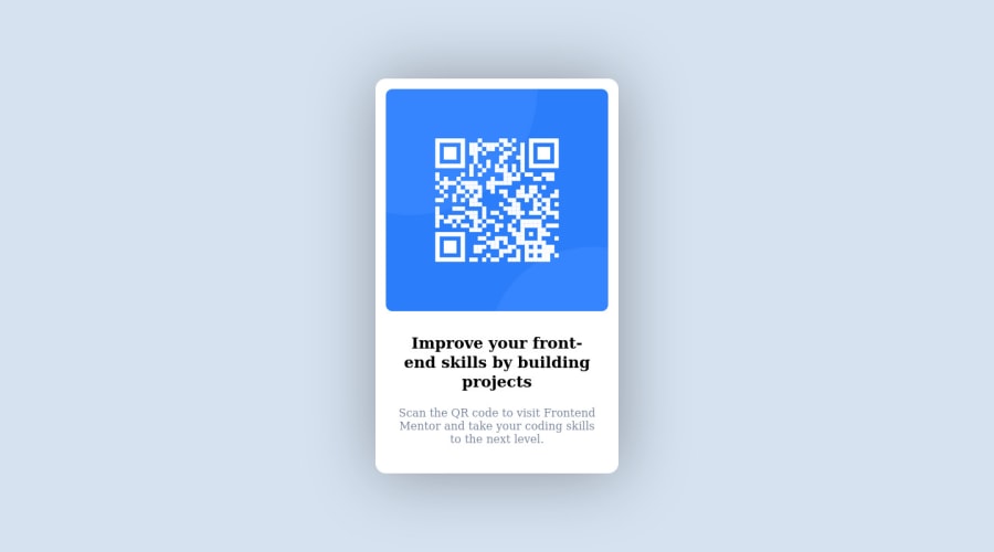
Design comparison
Solution retrospective
The project was good and I learn a lot. I found it difficult in importing the font family in my code. I tried my best but it was not working for me. I am sure of every code that I wrote in this project. I am hoping to do more projects in order to learn something new everyday.
Thanks!
Community feedback
- @correlucasPosted about 2 years ago
👾Hi @Flomoku231, congratulations on your solution!👋 Welcome to the Frontend Mentor Coding Community!
Great solution and a great start! From what I saw you’re on the right track. I’ve few suggestions for you that you can consider adding to your code:
1.Use
<main>instead of a simple<div>this way you improve the semantics and accessibility showing which is the main block of content on this page. Remember that every page should have a<main>block and that<div>doesn't have any semantic meaning.2.The main heading has the tag
<h2>, in this case, you should replace it with<h1>since this heading is the main title on this page. Remember that every page should have one<h1>to declare which is the most important title and that you should follow the hierarchy using the heading sequence(h1, h2, h3, h4, h5)and never jump a level.3.Instead of using
IDto give style to your elements, useCLASSthat’s better, note that withidthese styles are not reusables, so prefer to useIDforms and Javascript andCLASSfor styling.It is not advisable to use IDs as CSS selectors because if another element in the page uses the same/similar style, you would have to write the same CSS again.Here's my solution for this challenge if you wants to see how I build it: https://www.frontendmentor.io/solutions/qr-code-component-vanilla-cs-js-darklight-mode-nS2aOYYsJR
✌️ I hope this helps you and happy coding!
0@Flomoku231Posted about 2 years ago@correlucas Wow! I never thought of receiving such educative feedback from this challenge. You have thought me a lot from your feedback. I have made these mistakes on many of my personal projects. I am glad that I joined this community.
Thanks a lot!
0 - @NikolaiKozPosted about 2 years ago
Hello friend, a little feedback, the main text is from another font and the color is not black, both things are indicated in the style file, and seeing your result I realized that I also made the same mistake, haha, greetings and many successes!
0@Flomoku231Posted about 2 years ago@NikolaiKoz Lol!! I just notice it. Thanks for the feedback.
0 - @MrBlackvantaPosted about 2 years ago
Hey EMMANUEL congratulation on solving the challenge, lovely work.
as for the code try to use google fonts go to the website, select the font family you want, select the weights you want then in the right sidebar you shall find a link that looks like this
<link rel="preconnect" href="https://fonts.googleapis.com"><link rel="preconnect" href="https://fonts.gstatic.com" crossorigin><link href="https://fonts.googleapis.com/css2?family=Kumbh+Sans:wght@400;700&display=swap" rel="stylesheet">copy it and paste in your html
headbefore the CSS link tag and then apply it in your CSS using thefont-familyproperty like thisfont-family: 'Kumbh Sans', sans-serif;0@Flomoku231Posted about 2 years ago@MrBlackvanta Wow! Thanks so much for your solution. I will implement that method on my next challenge.
0@MrBlackvantaPosted about 2 years ago@Flomoku231 You're welcome bud. In the future if you ever needed help with a challenge don't hesitate to contact me. [email protected] Cheers
0
Please log in to post a comment
Log in with GitHubJoin our Discord community
Join thousands of Frontend Mentor community members taking the challenges, sharing resources, helping each other, and chatting about all things front-end!
Join our Discord
