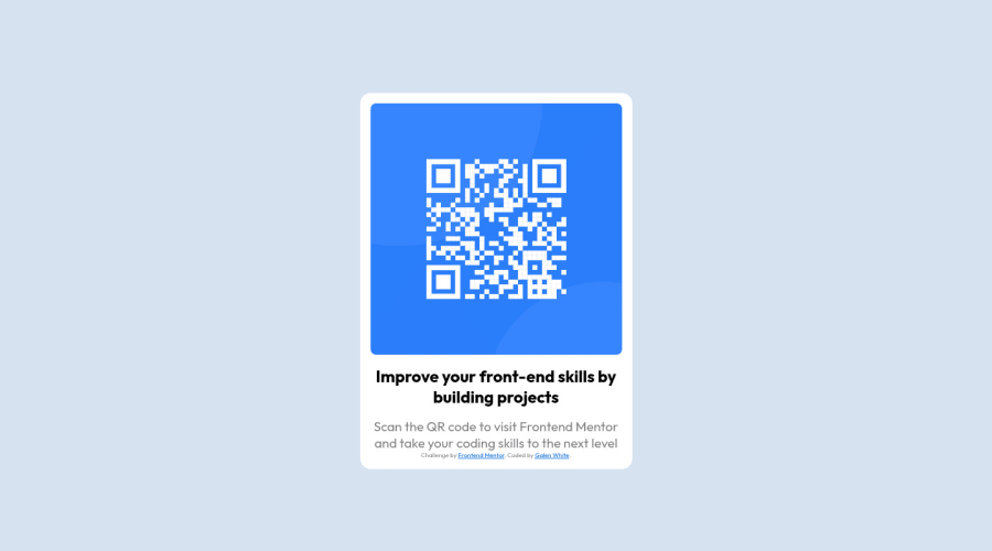
Design comparison
Solution retrospective
I found it difficult/intimidating to make the page properly viewable on mobile. My main concern is that, when my page is viewed from the devtools mobile viewport on Firefox, the screen height is needlessly big and requires unnecessary scrolling to view the QR code properly. I ended up reaching out to a friend who is more experienced in coding than I, and he assured me that the page would be properly viewable on an actual phone screen.
What I'd like feedback on is whether I succeeded in making the page comfortably viewable on mobile, and if my friend is correct about viewing it by phone.
Thank you so much :)
Community feedback
- @AyoifePosted about 2 years ago
Hi @Galen, Congrats on completing your first challenge!!
I viewed your site from my phone and I found out that there was still some vertical scrolling, but if it makes you feel any better, I checked the mobile design for the challenge and there was also some vertical scrolling. But the main thing is that the users should be able to view the QR-Code Component properly which the solution you submitted passed but if you want to be finicky, then you can consider reducing the width and height of the
cardclass to that of the design in the project folder and probably solve the scrolling problem. I hope I was of a little help and I hope to see many more completed challenges from you :)Marked as helpful2@JudasThePriestPosted about 2 years ago@Ayoife Thank you so much! Yeah I'm obviously starting out but want to be able to get my code as close to "perfect" as possible, so any feedback helps. I'll look into what you've suggested for sure.
0
Please log in to post a comment
Log in with GitHubJoin our Discord community
Join thousands of Frontend Mentor community members taking the challenges, sharing resources, helping each other, and chatting about all things front-end!
Join our Discord
