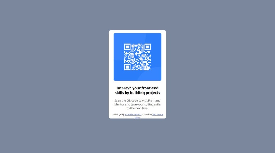
Design comparison
Solution retrospective
Just finishing the project with it looking as close to the final solution as possible. I know there are better ways of achieving the final product, reducing unnecessary code and making the product mobile friendly are the goals for the next project.
What challenges did you encounter, and how did you overcome them?Aligning the overall product to the center and making sure everything looked as close to the final product as possible, there were a lot of margin and padding tweaking.
What specific areas of your project would you like help with?Making the project mobile friendly. While I have a faint grasp of media queries, I'm not to sure on how to actually make things accessible on mobile devices/different screen sizes.
Community feedback
- @DanCodeCraftPosted 12 months ago
Good job, @TheGroshin.
Let me highlight a few points I believe you can work on in this, or on your next project.
Design:
- The background color is a bit off, making the component fade out a little bit. The padding at the top is way different from the ones on the side. This gives the impression that the QR code is off-center.
- You're not using the right font, nor the correct colors for each section.
- You can/should have your footer outside the container, so the focus would be on the component only.
Code:
- Your whole container is not centralized on the screen. If you make your display 3000px, for example, it will go all the way to the top. Here's a quick way to centralize it:
body { min-height: 100vh; display: flex; justify-content: center; align-items: center; }- You should always do a modern reset on your CSS before starting any project. I recommend the one by Josh Comeau - although, there are others you can check out.
- You're using weird units of measure for your styling. Fonts should be set in rem, not px. And the same goes for the border-radius, and so on. Kevin Powell has a cool video talking about measures on YouTube.
- When you set your screen to mobile view, then the whole right margin is gone.
Hope it helps. Keep up the good work!
0 - @DanijelAdrinekPosted 12 months ago
Hey Groshin (hope I didnt miswrite that), I have taken a look at your project, and found some things I believe could be done better, and help you become a better web developer
-
The body should take up 100% of user's screen, and shouldnt have any margin, to do that, you will need to add these properties: body { display: flex; justify-content: center; align-items: center; margin: 0; }
Keep in mind, you will need to remove the margins on the card for this to work properly.
-
To avoid confusion in the case of someone else working on the code after you, classes like image and text, should actually be called image-container and text-container, because image and text should be added to actual elements containing the image and the text, not their parent elements
-
you should select the QR code image with a selector of .image-container > img {/** some styles **/}
That is in case that the project grows bigger, you dont want that same style being applied to every image, and this will help you select the image you want selected instead of all of them.
I also made a blog post about solving this problem to help anyone wanting to become a better web developer with free advice that I personally believe (maybe I'm a little bias ) will help you learn more about how to become a great web developer.
in case you are interested, here is the link: https://dev.to/danijeladrinek/frontend-mentor-qr-code-challenge-4g9h
I hope this helps you become a great web developer, and helps you land this awesome job! Happy coding, and if you have any questions, feel free to ask! :D
0 -
Please log in to post a comment
Log in with GitHubJoin our Discord community
Join thousands of Frontend Mentor community members taking the challenges, sharing resources, helping each other, and chatting about all things front-end!
Join our Discord
